Edgy Colonial Meets Resort Living in McLean, Virginia
Project Overview
Our clients purchased this home in 2021, knowing major renovations were needed. While the interiors had great potential, they felt dated, and the flow between rooms was disjointed, limiting daily function and entertaining. The exterior, though impressive, had architectural irregularities—window placements were misaligned, and the scale didn’t harmonize with the dormers. Our objective was to address these inconsistencies both inside and out, creating a unified, cohesive home that feels intentional and welcoming.
The clients wanted to refresh the home with bold finishes and an inviting atmosphere perfect for entertaining as their family grows. The design focused on modernizing the home with softened architectural corners and bold color choices while balancing these elements with neutral zones that serve as elegant backdrops for their extensive art collection.
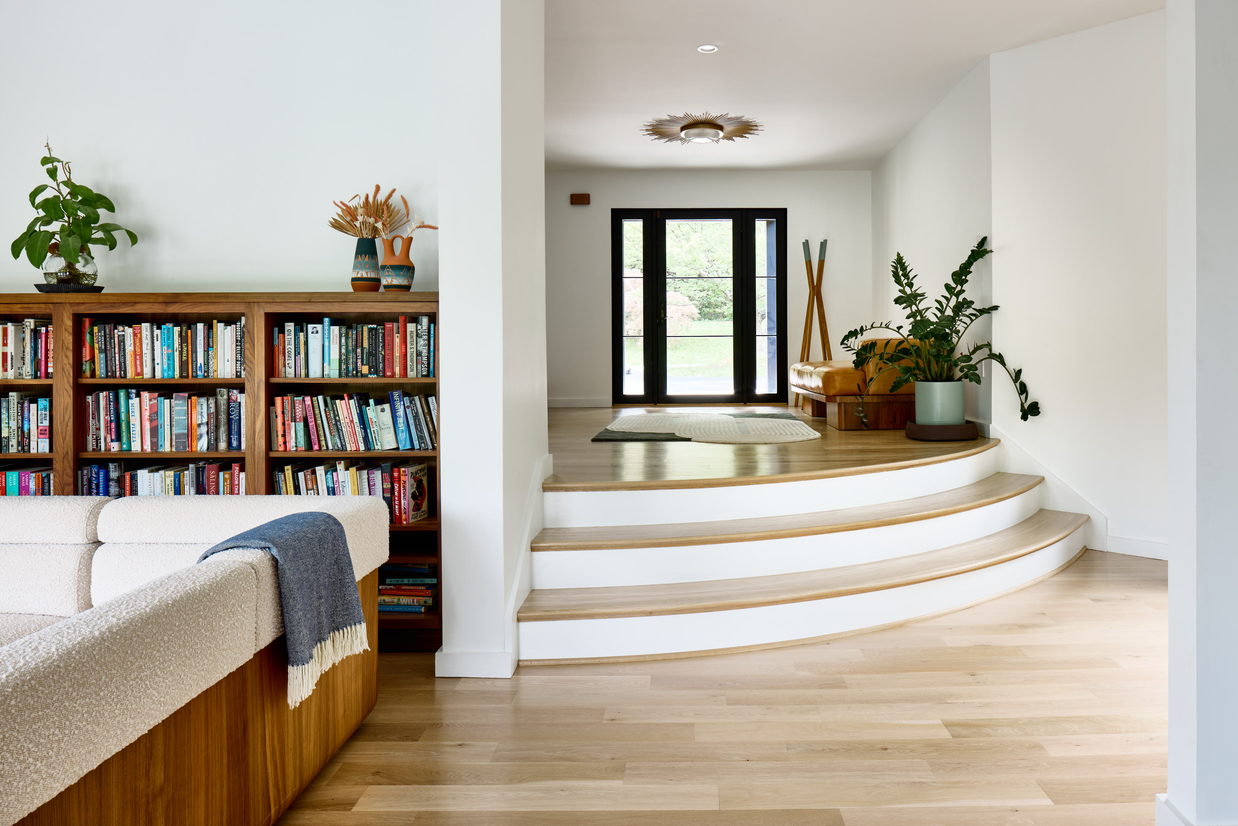
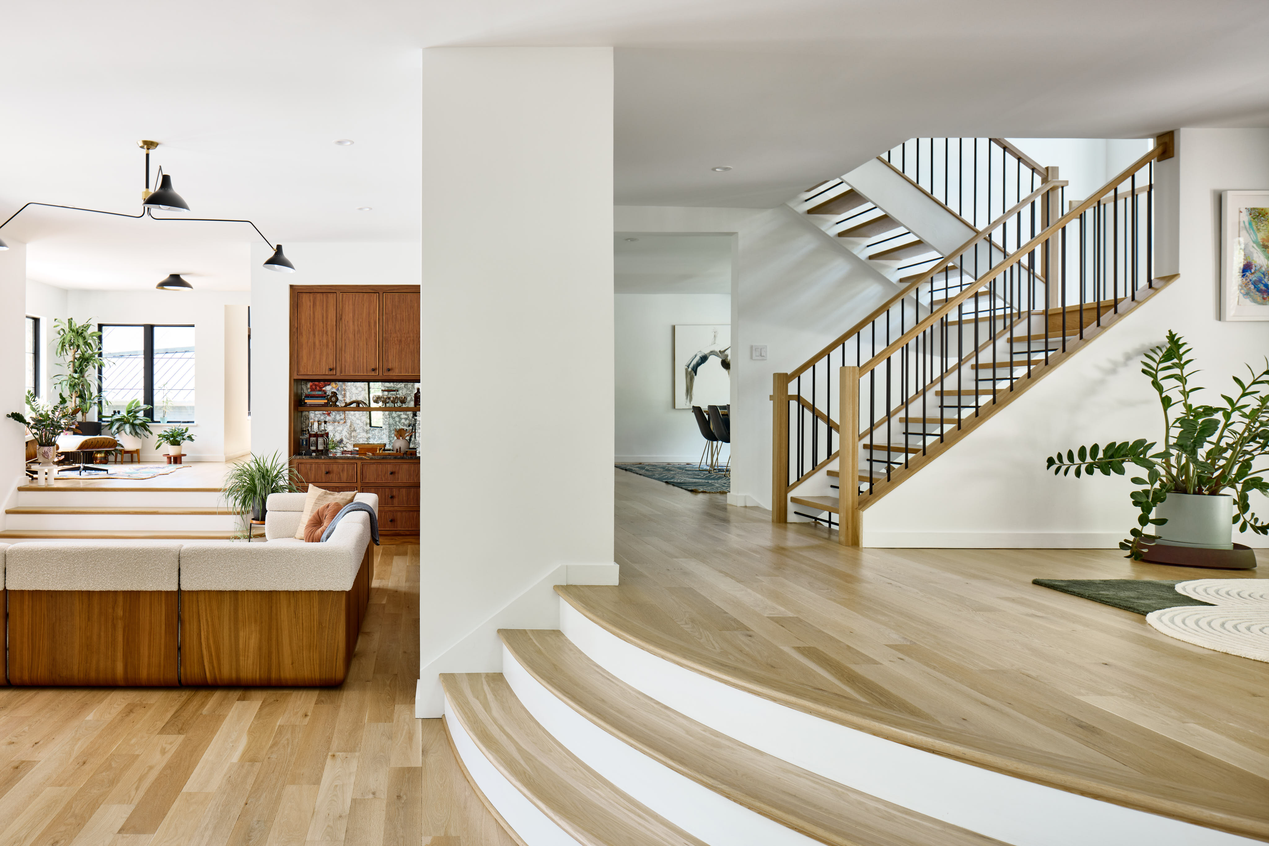
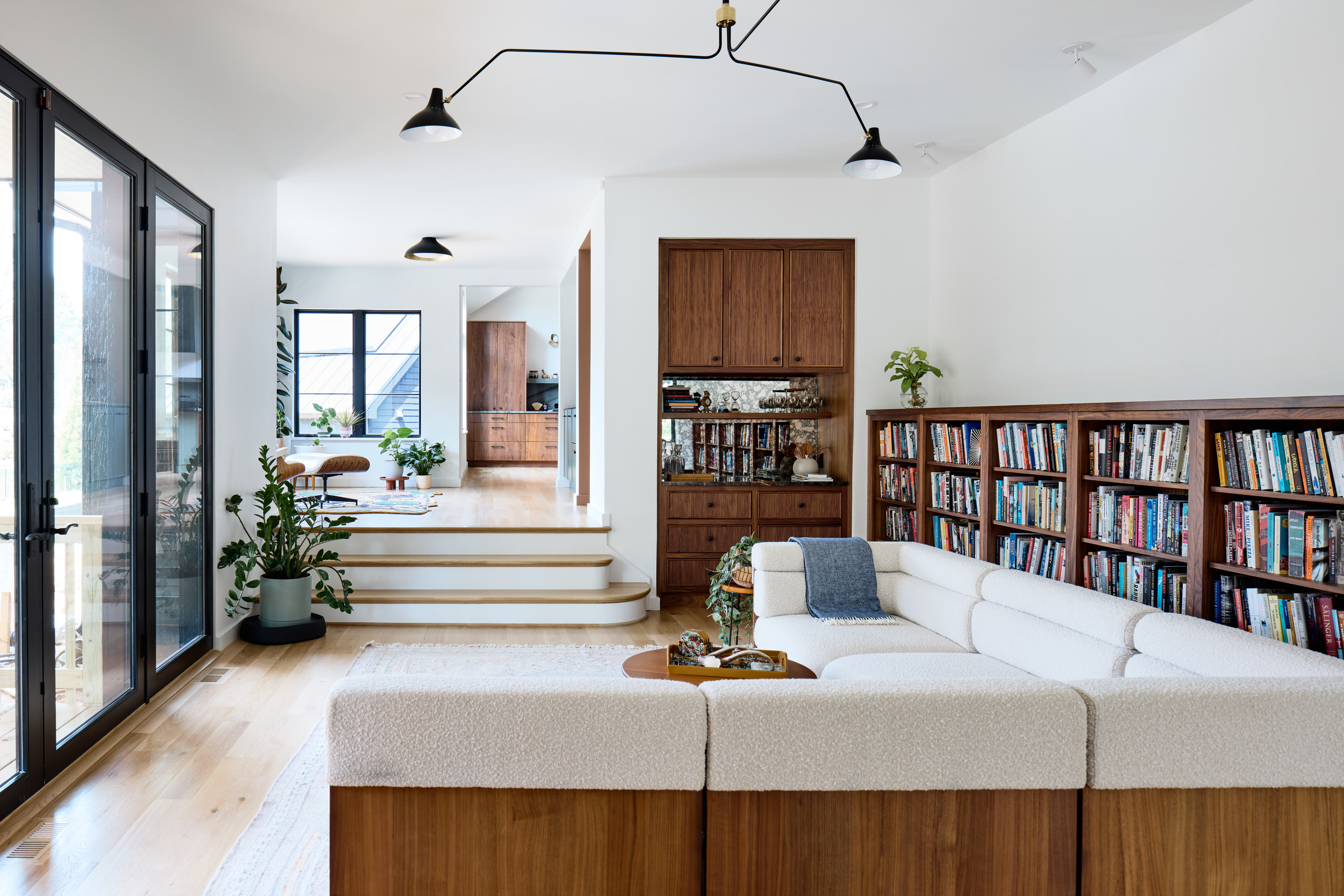
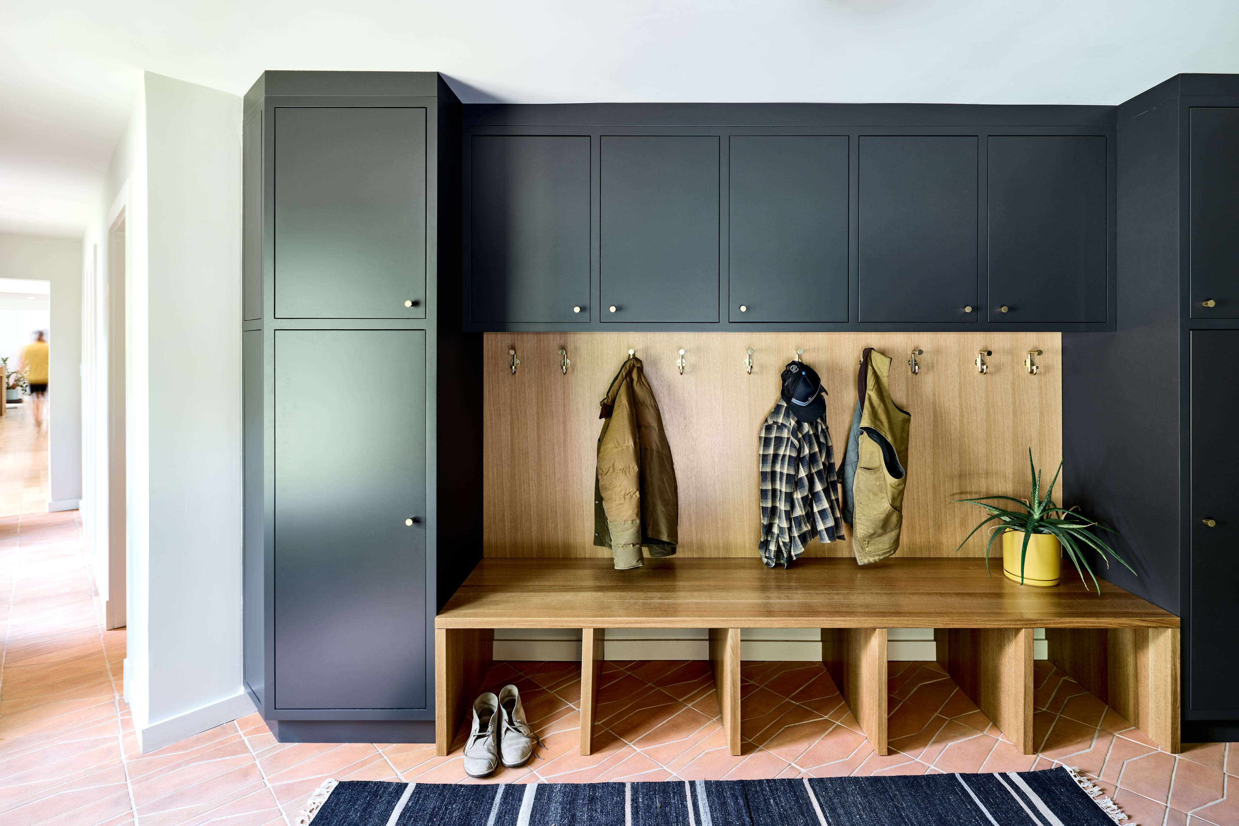
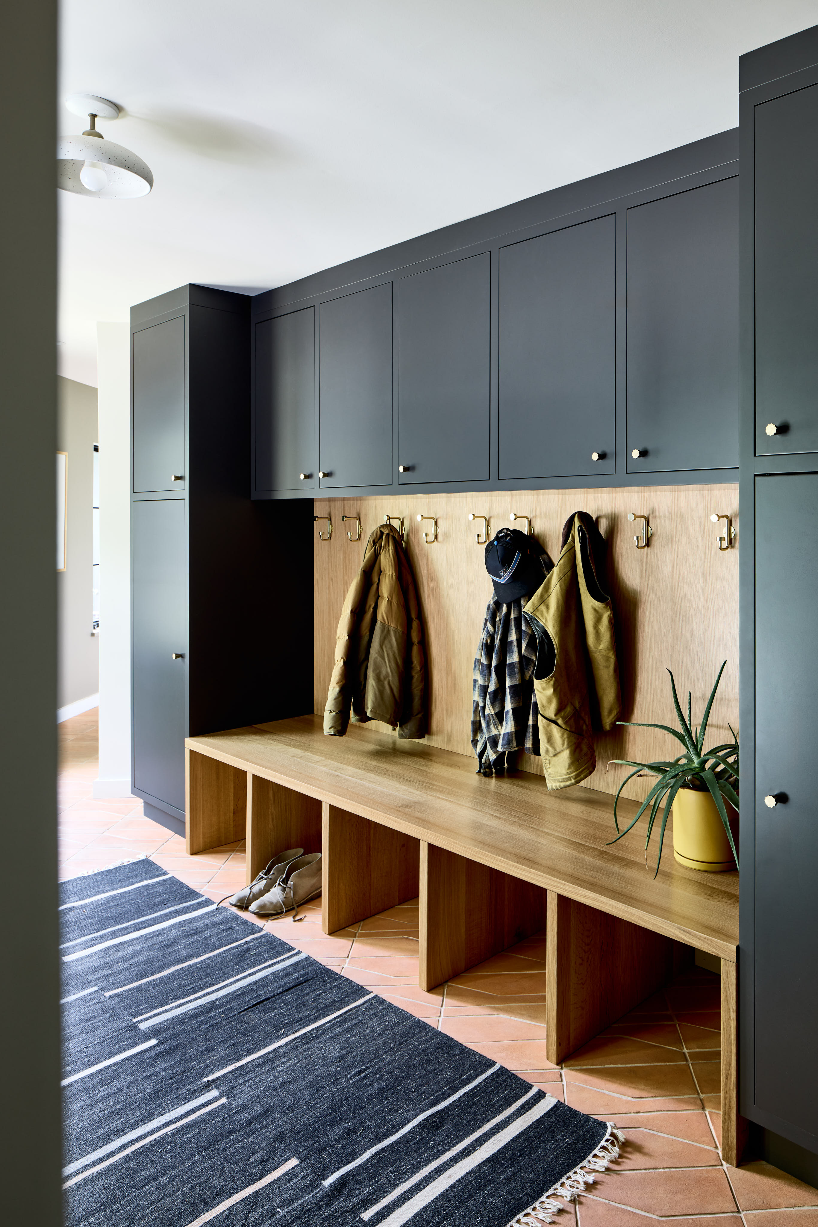
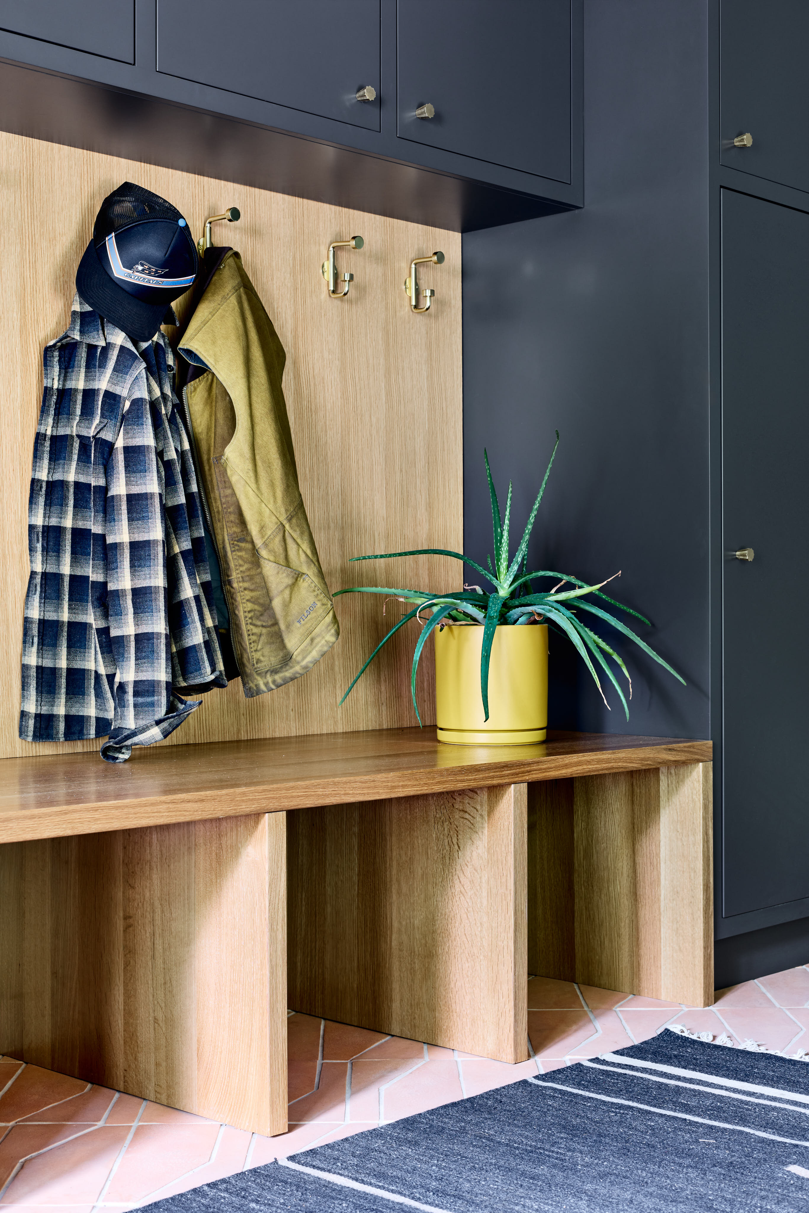
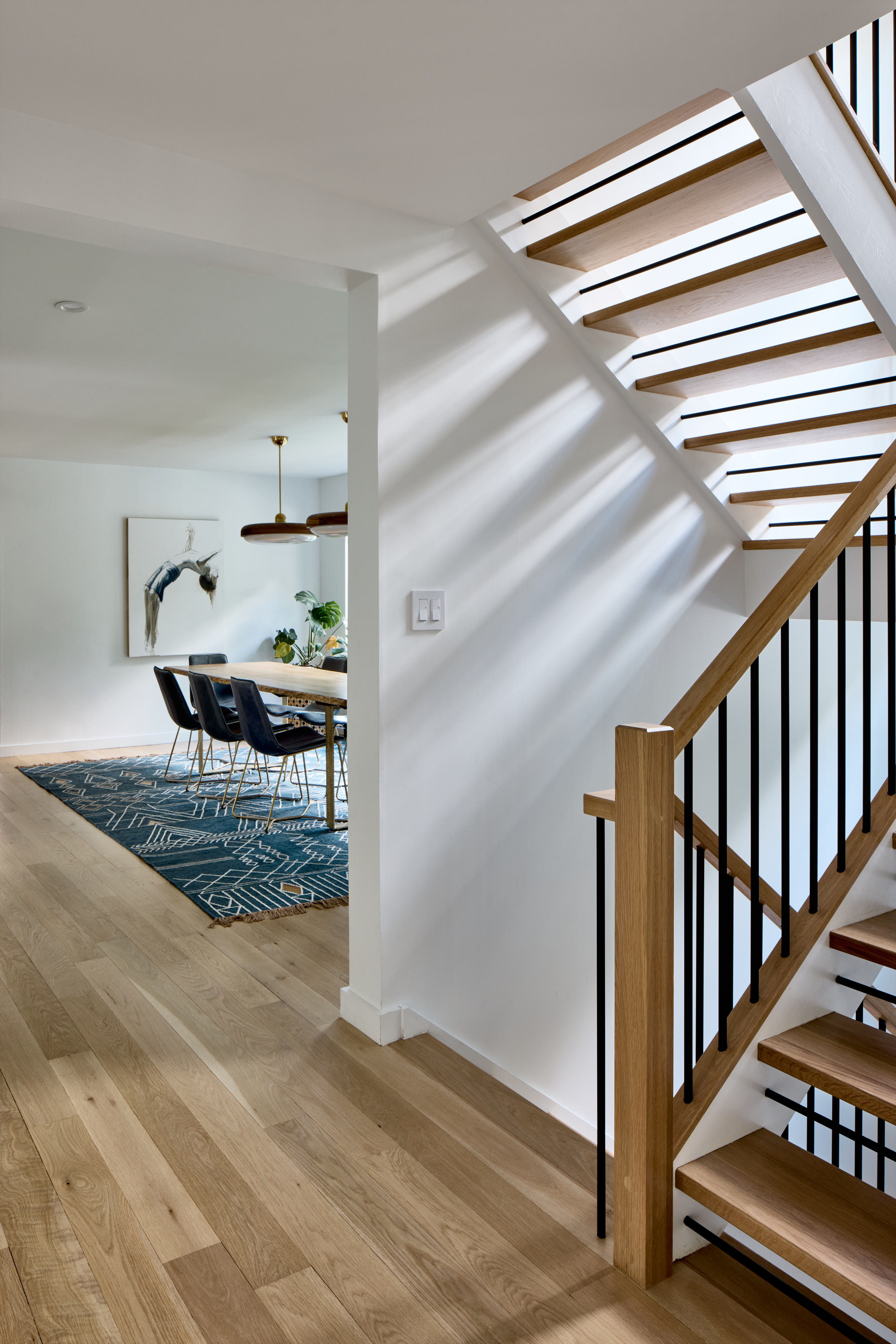
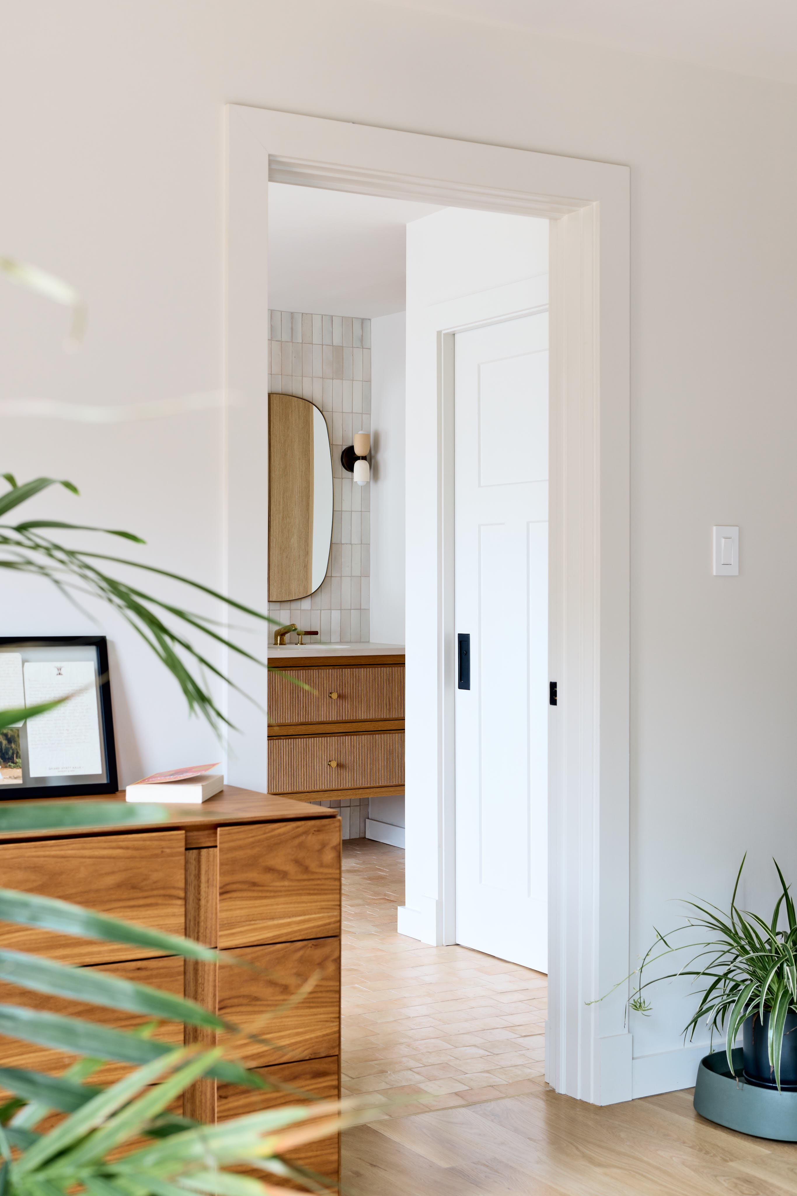
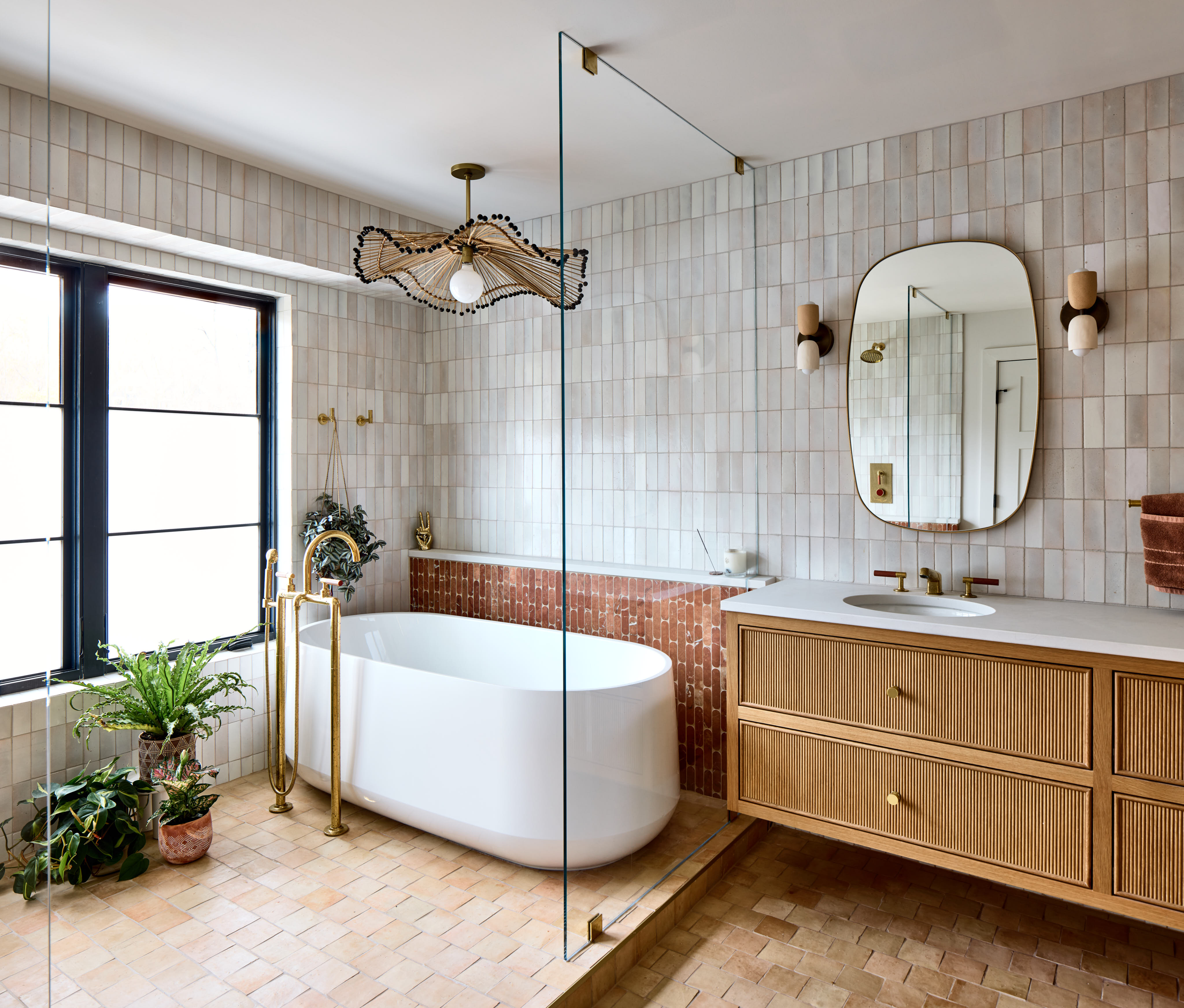
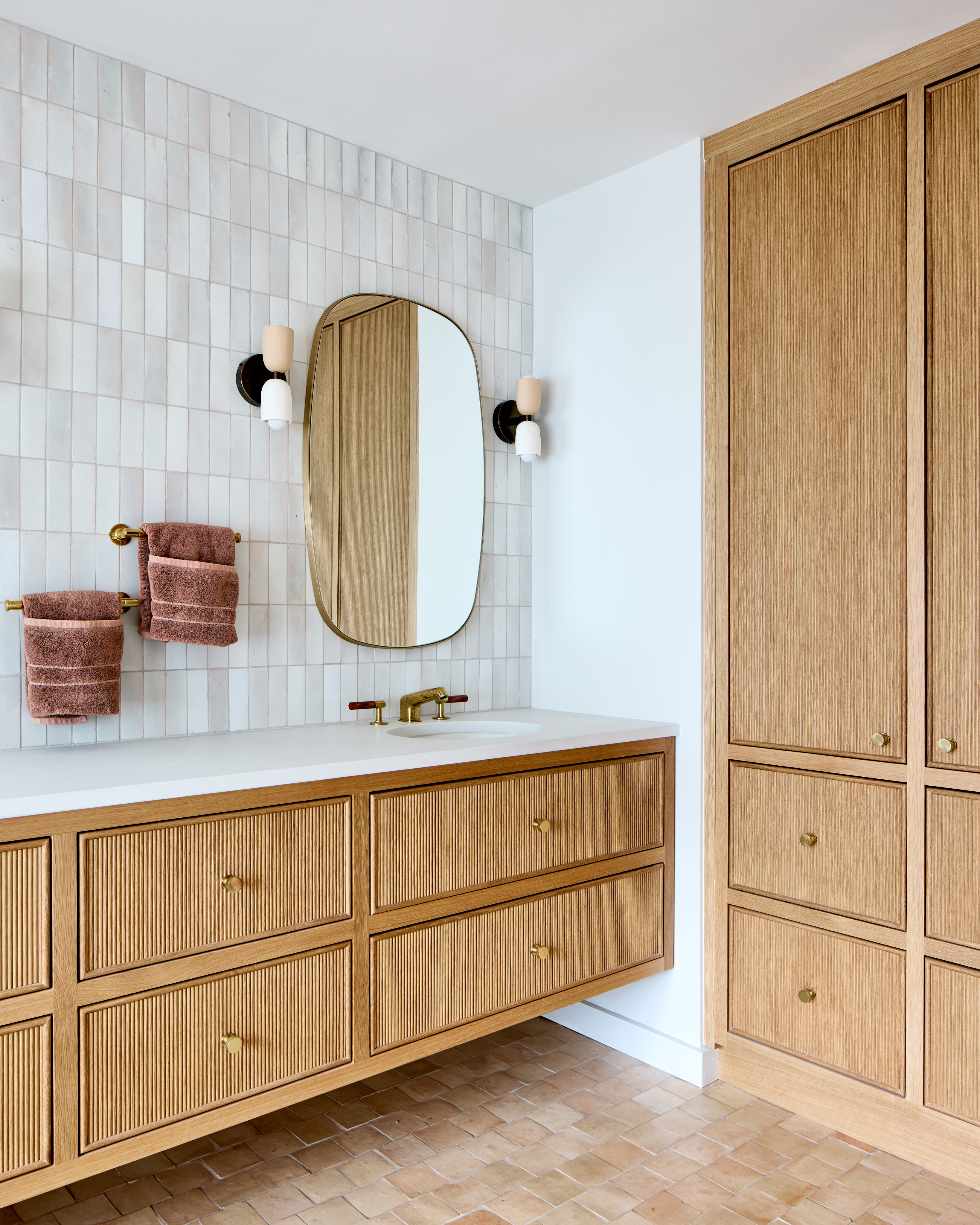
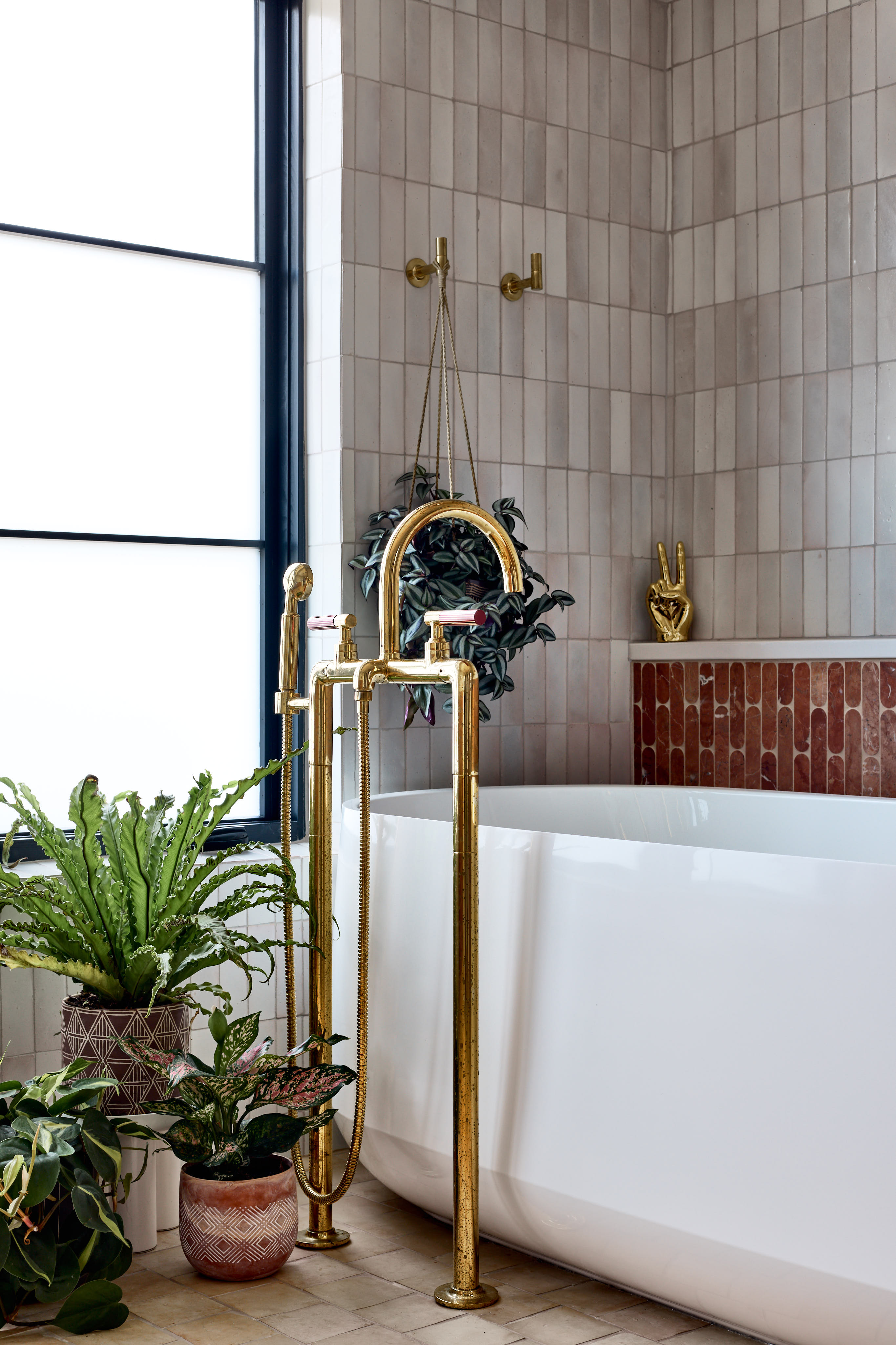
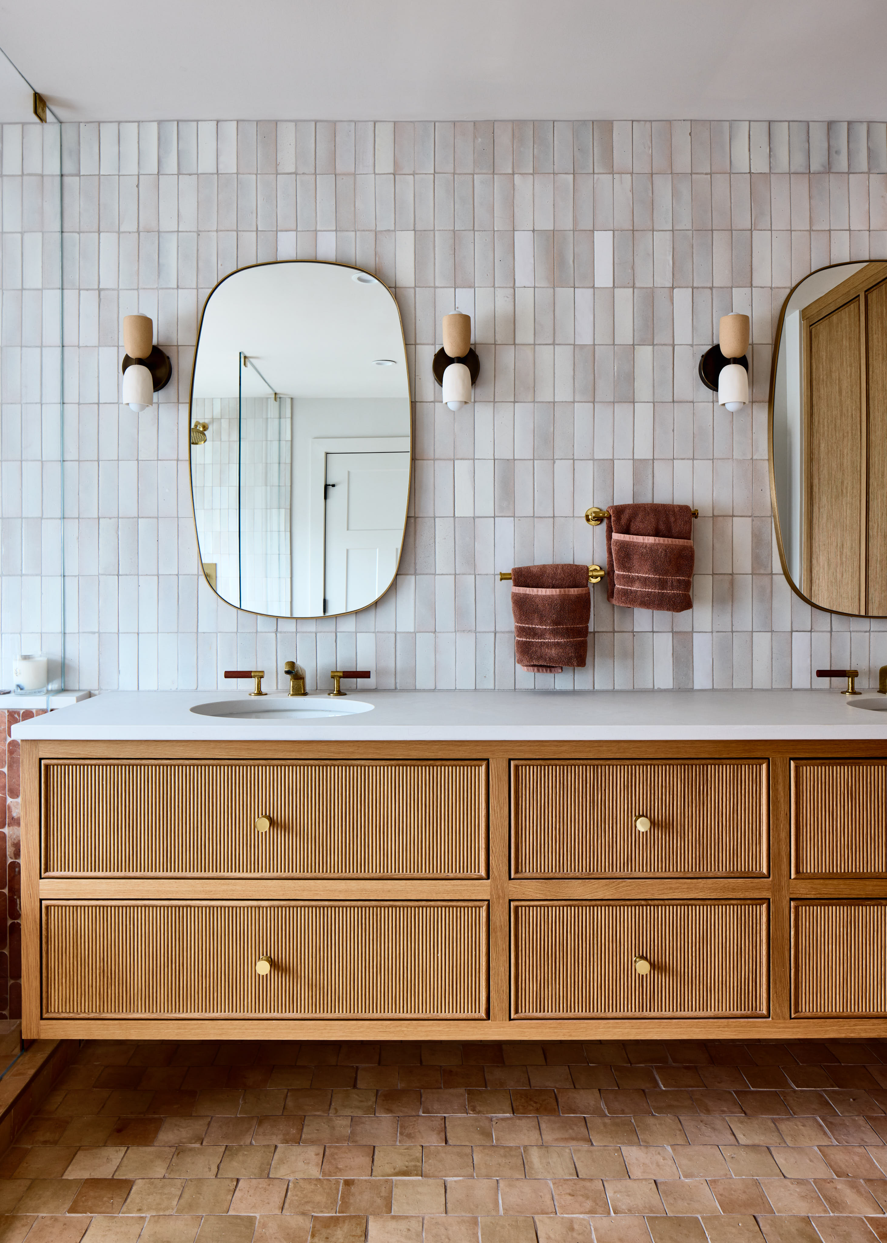
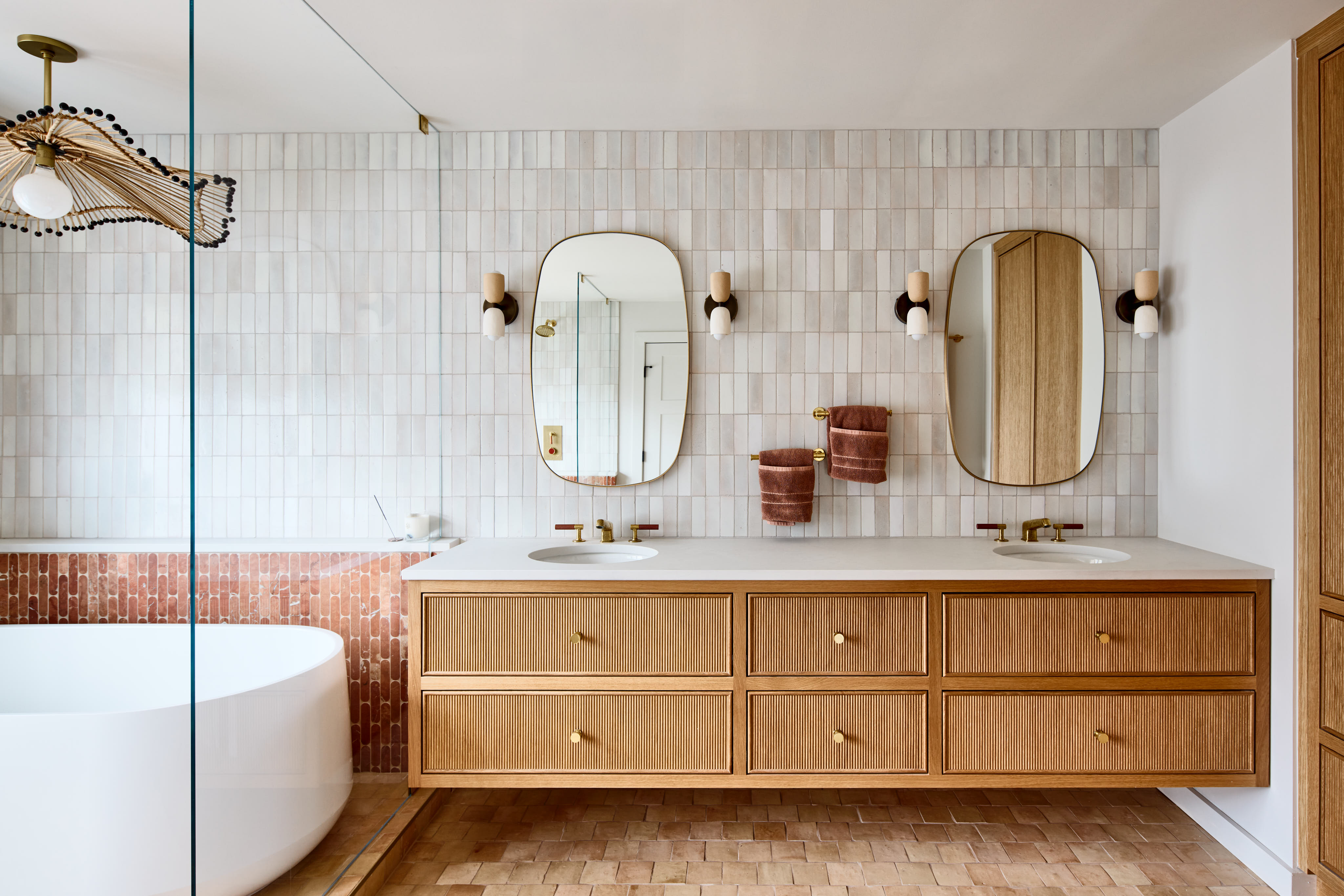
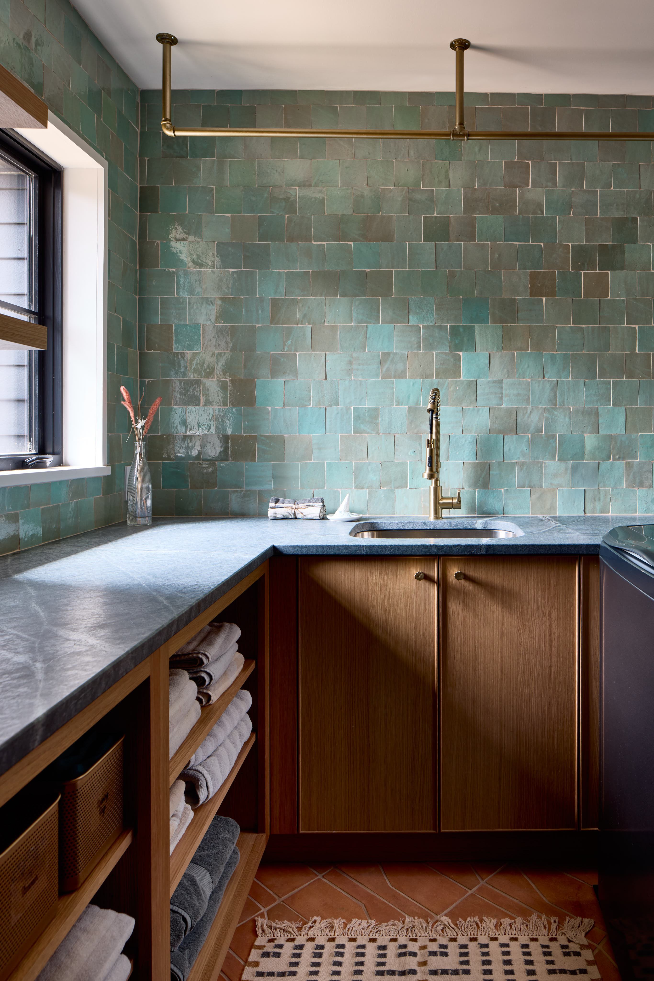
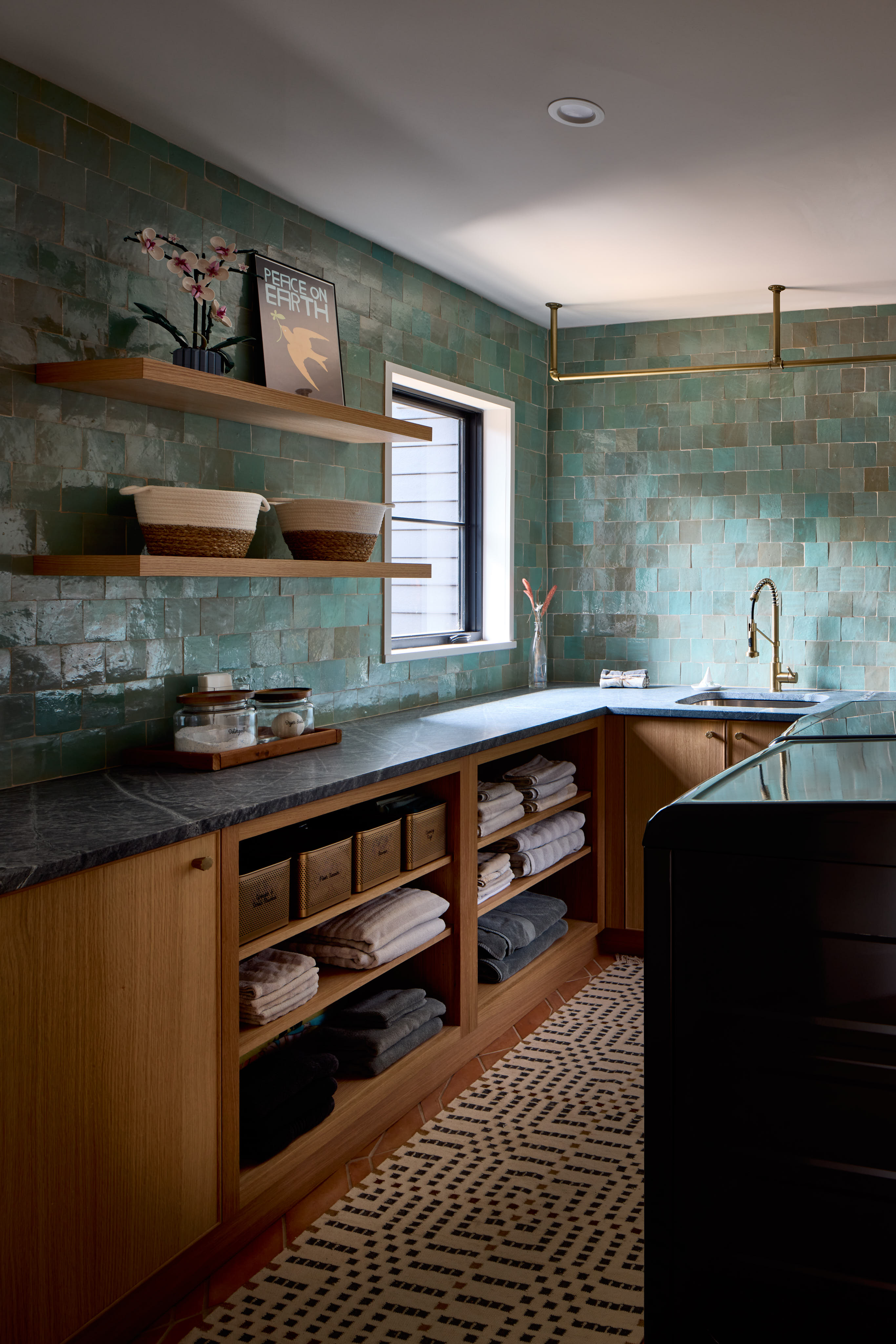
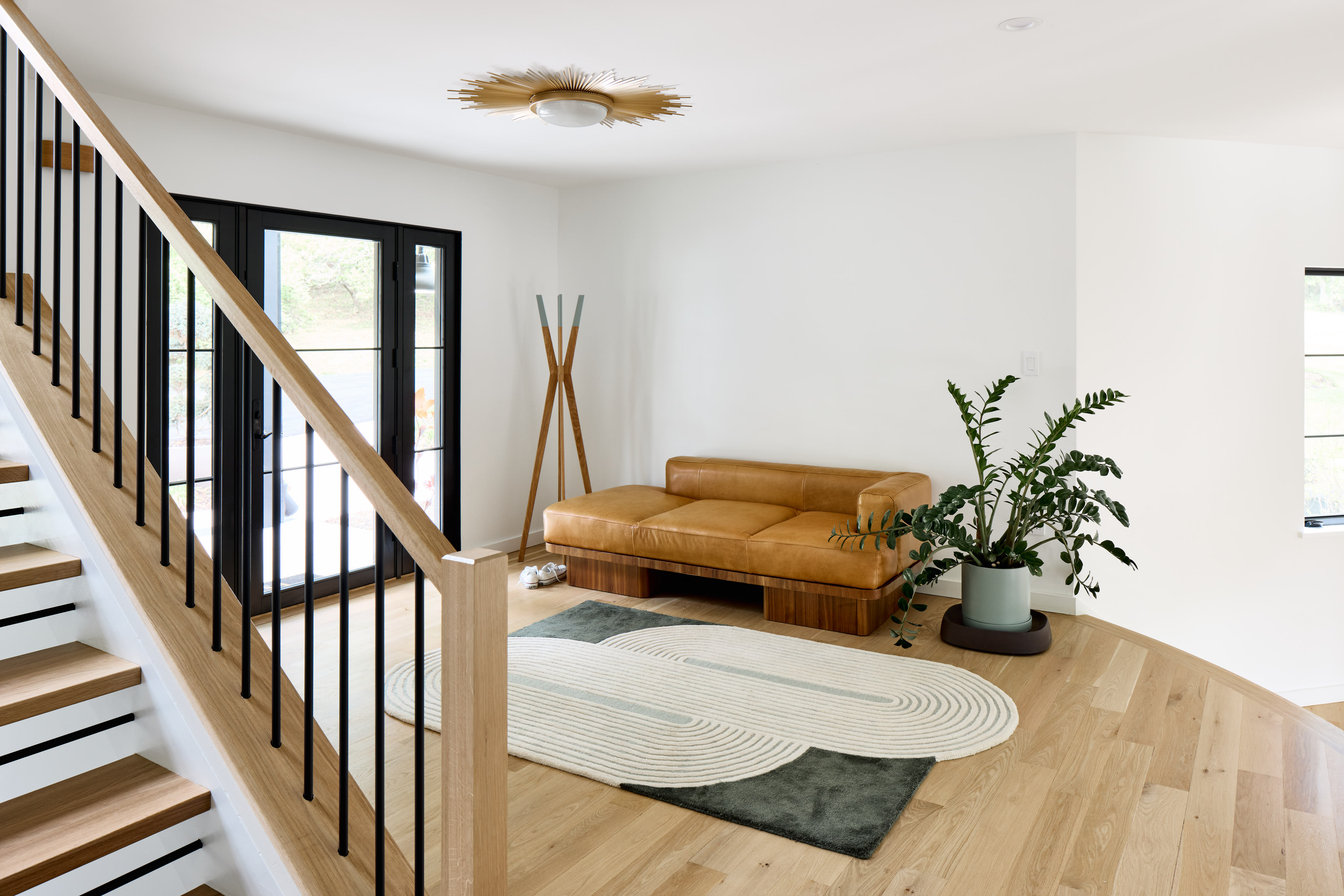
We installed natural white oak flooring and painted the walls a crisp white to highlight the homeowners’ carefully curated accessories and built-ins. In the more utilitarian spaces, we opted for terracotta flooring, selected for its durability. The homeowners embraced bolder colors in these areas to add character and personality. The clients expressed that, since laundry would become a bigger part of their routine with a growing family, they wanted the space to be both functional and fun.
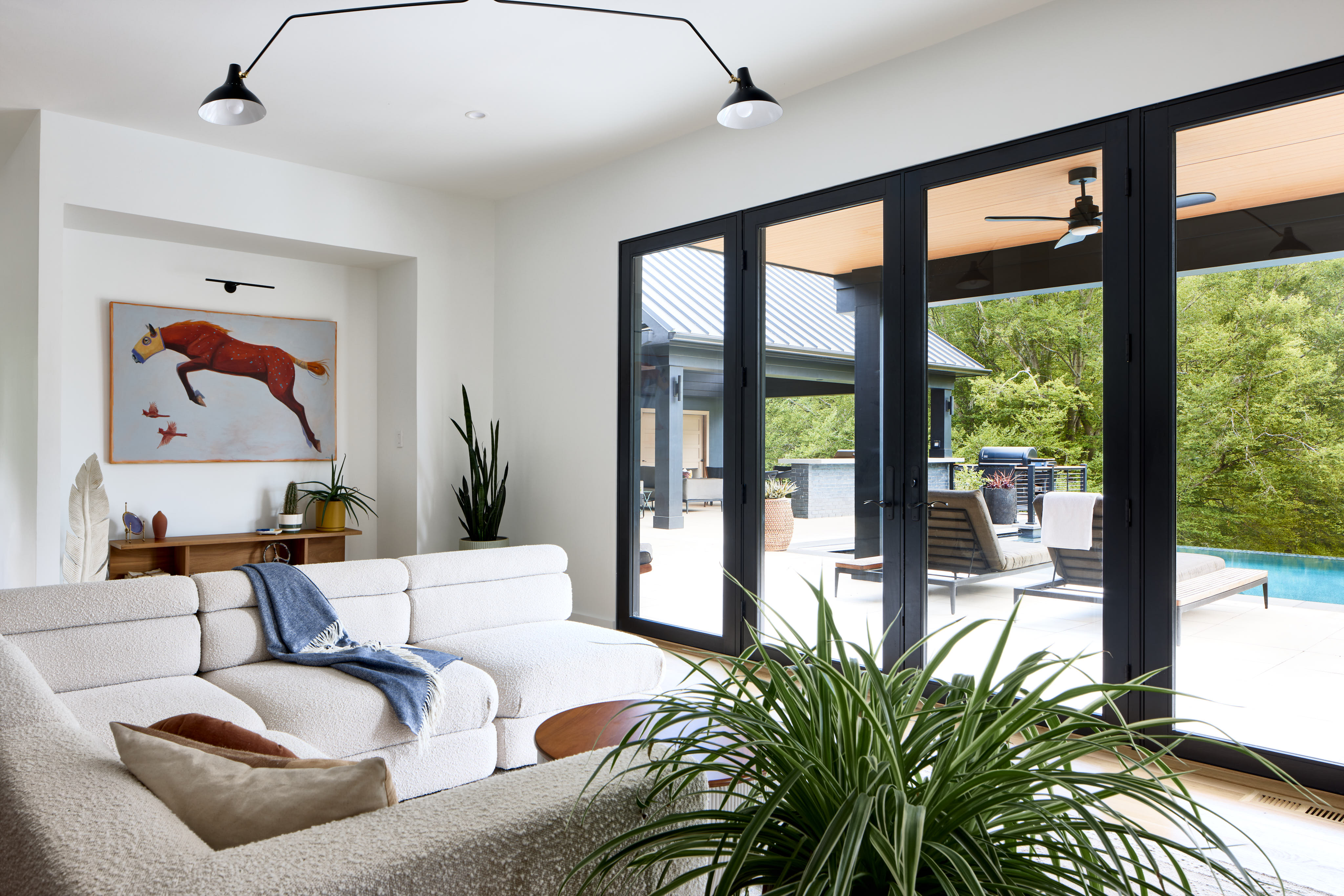
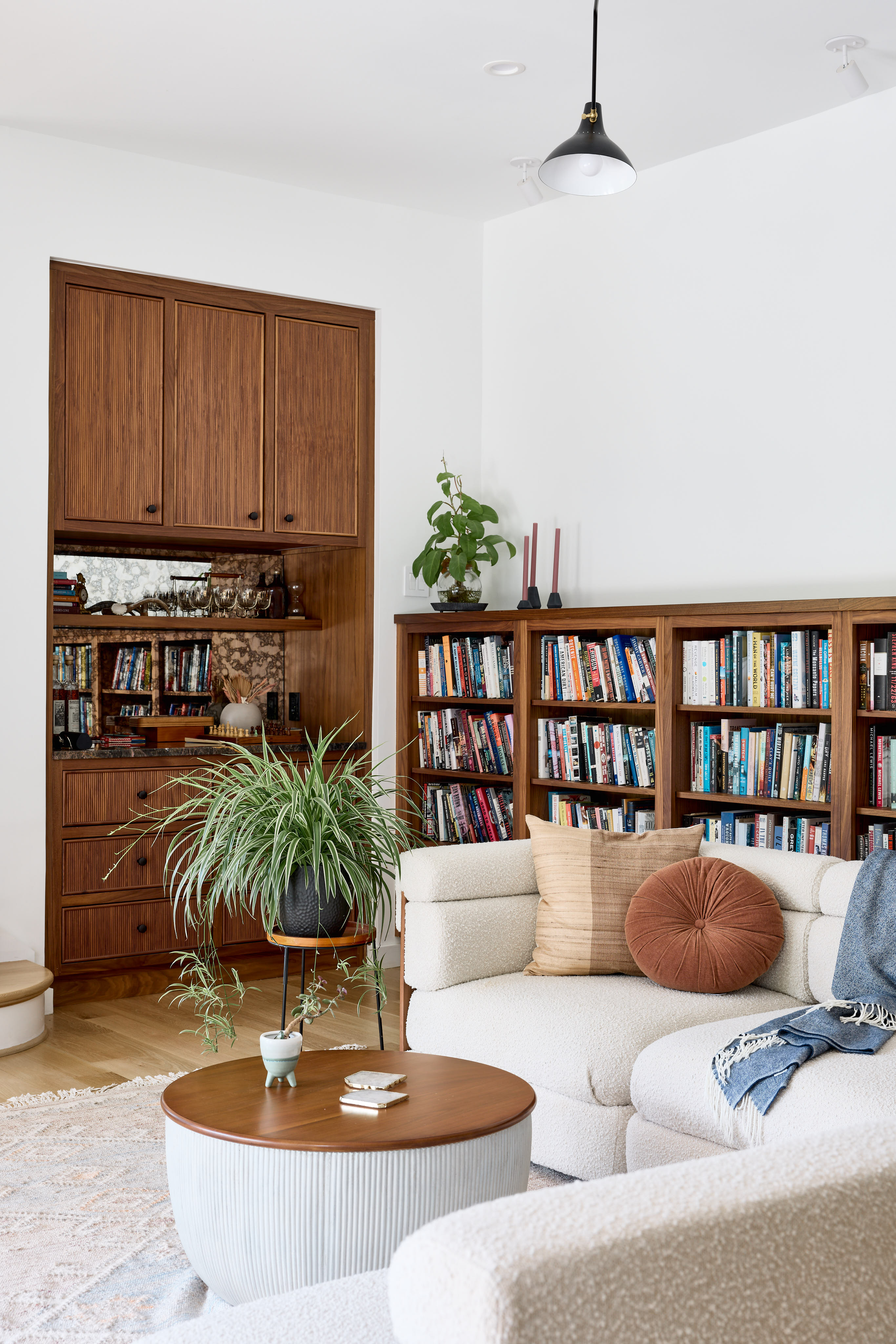
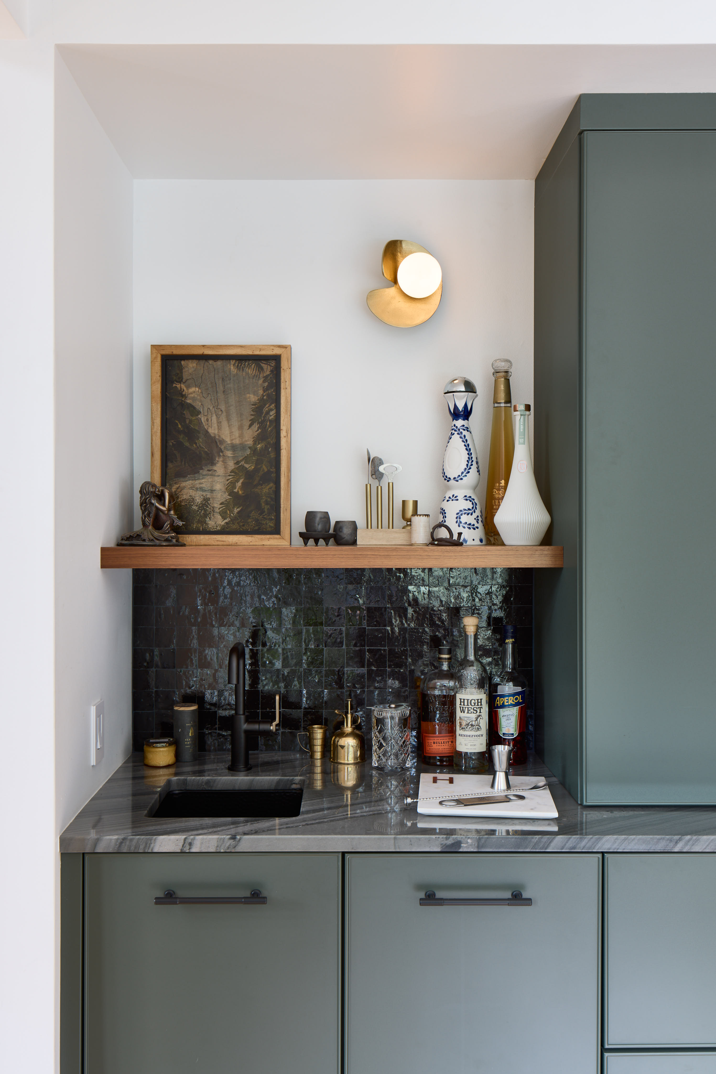
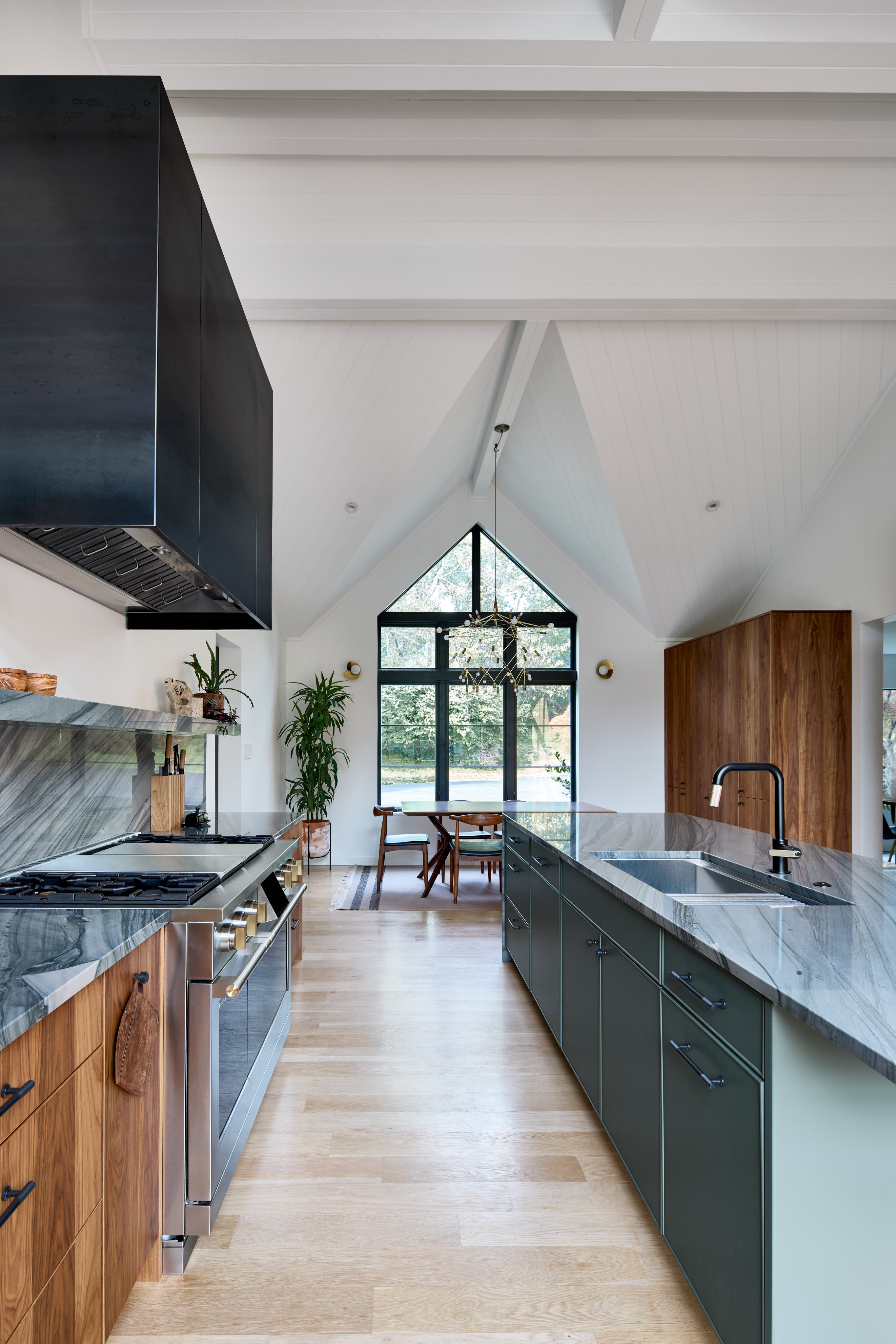
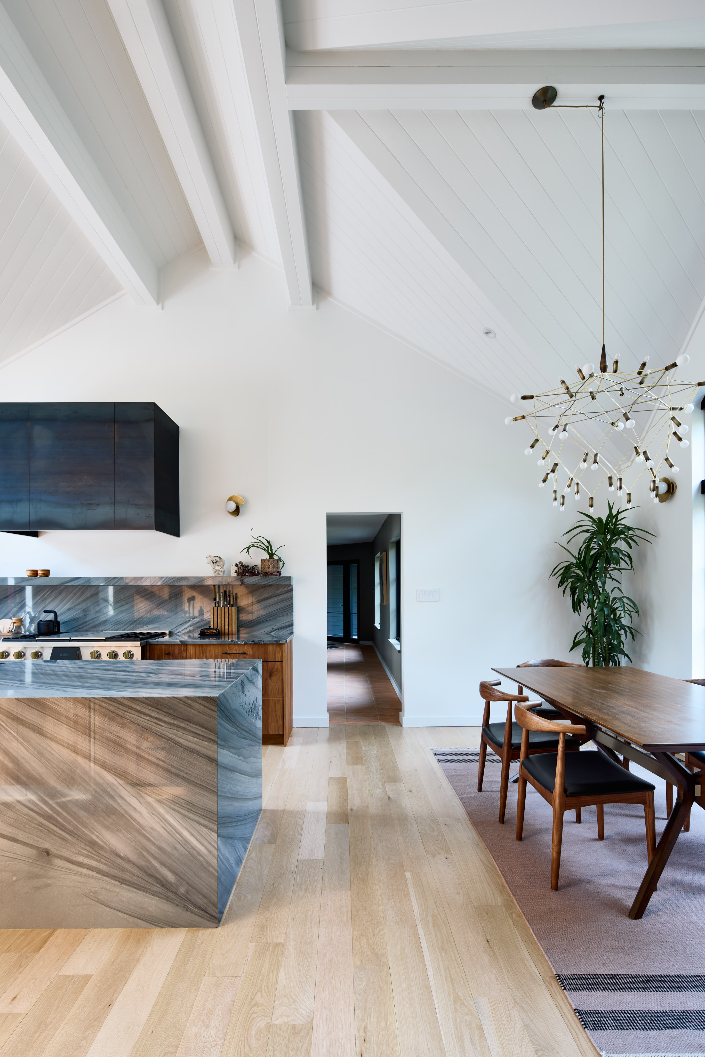
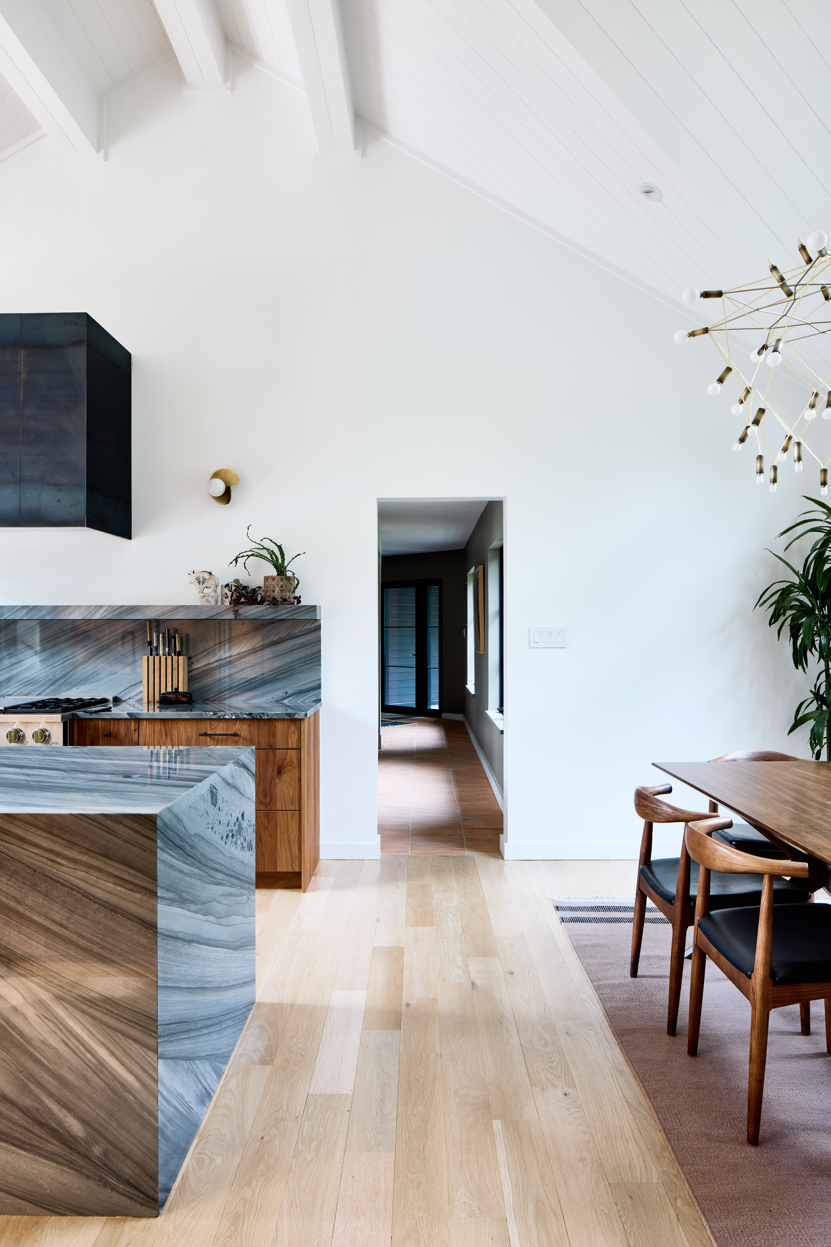
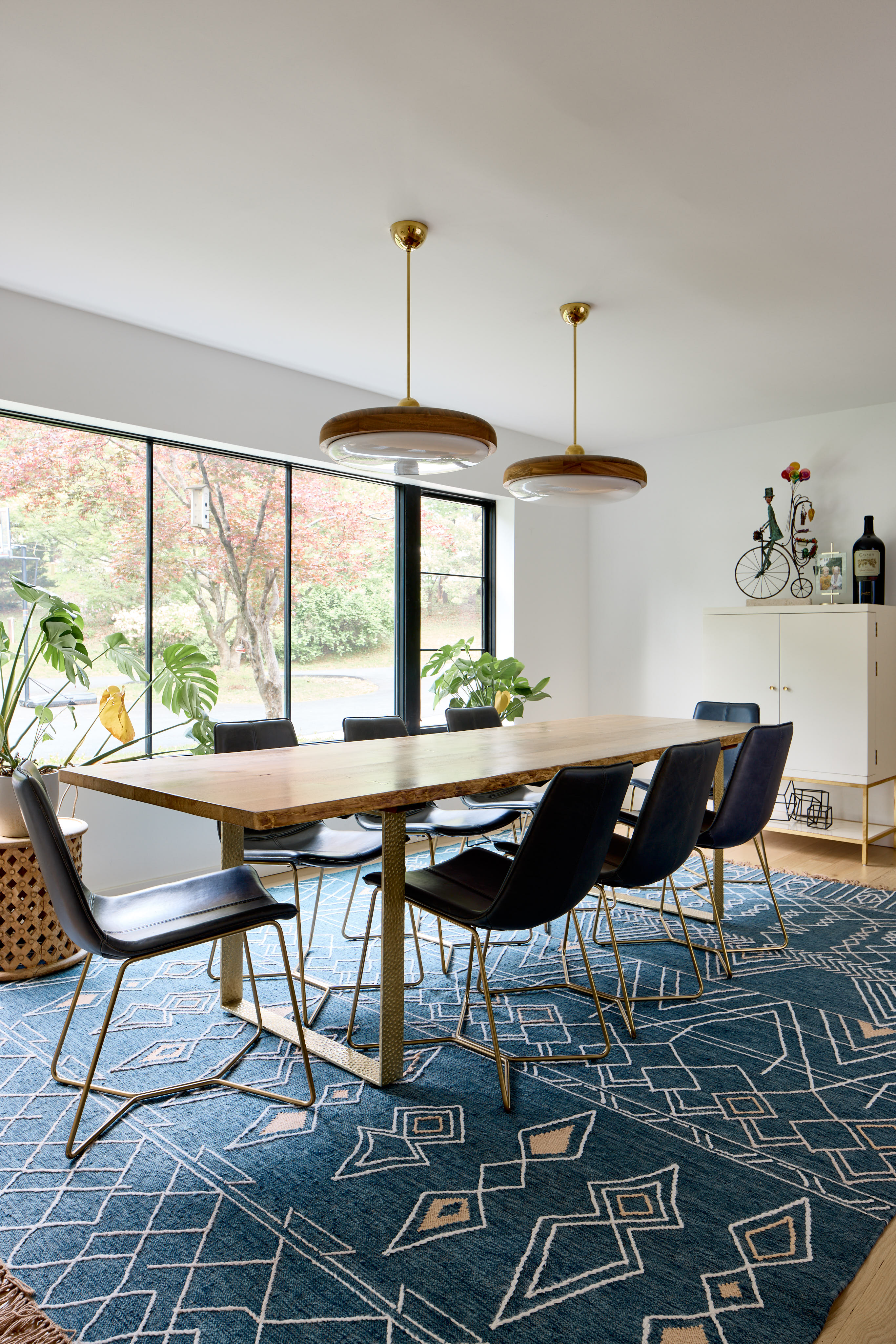
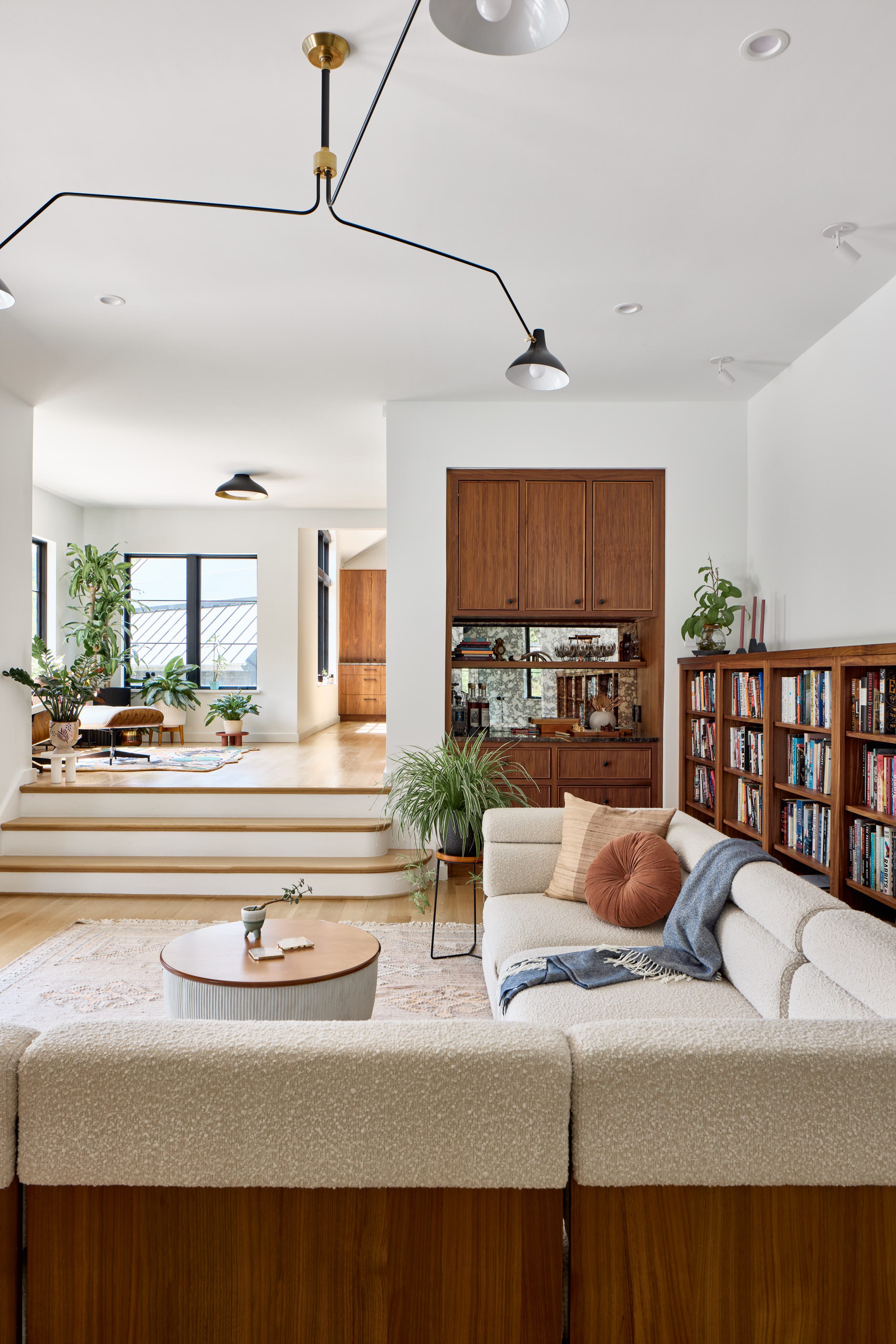
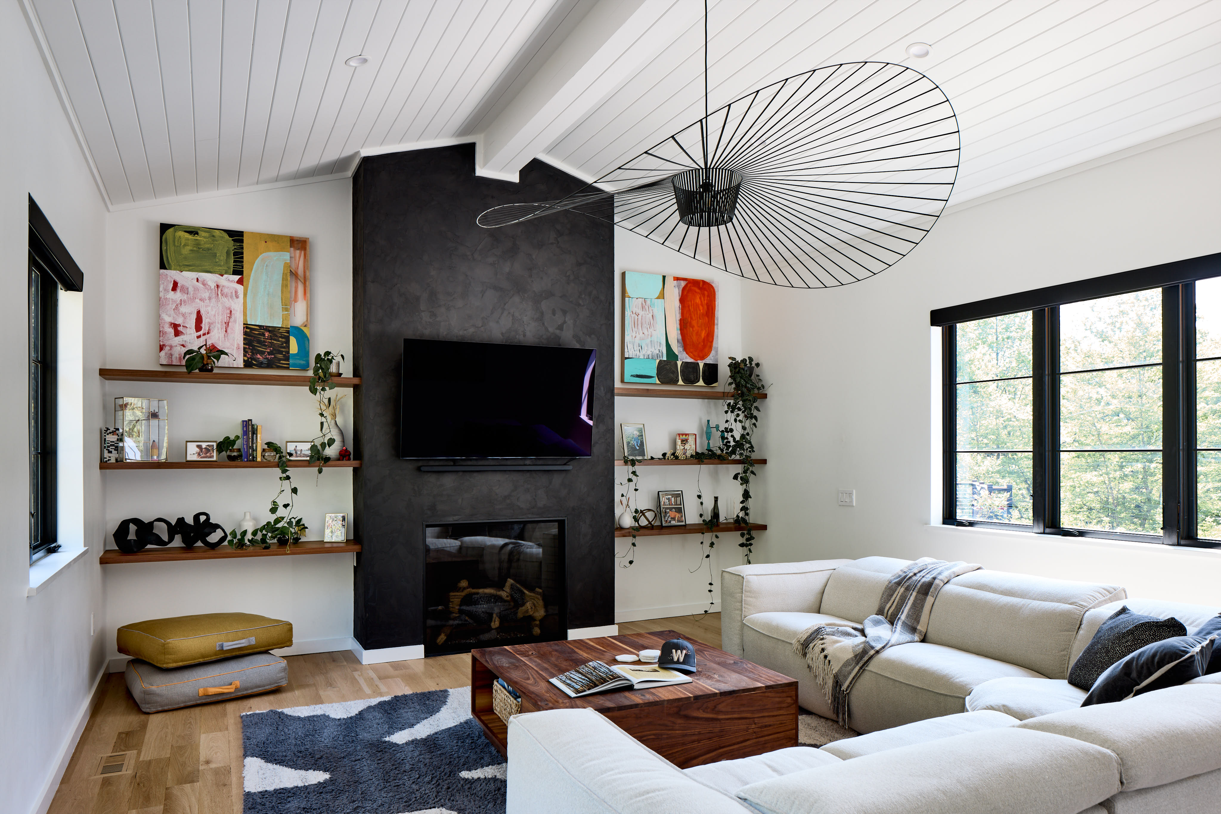
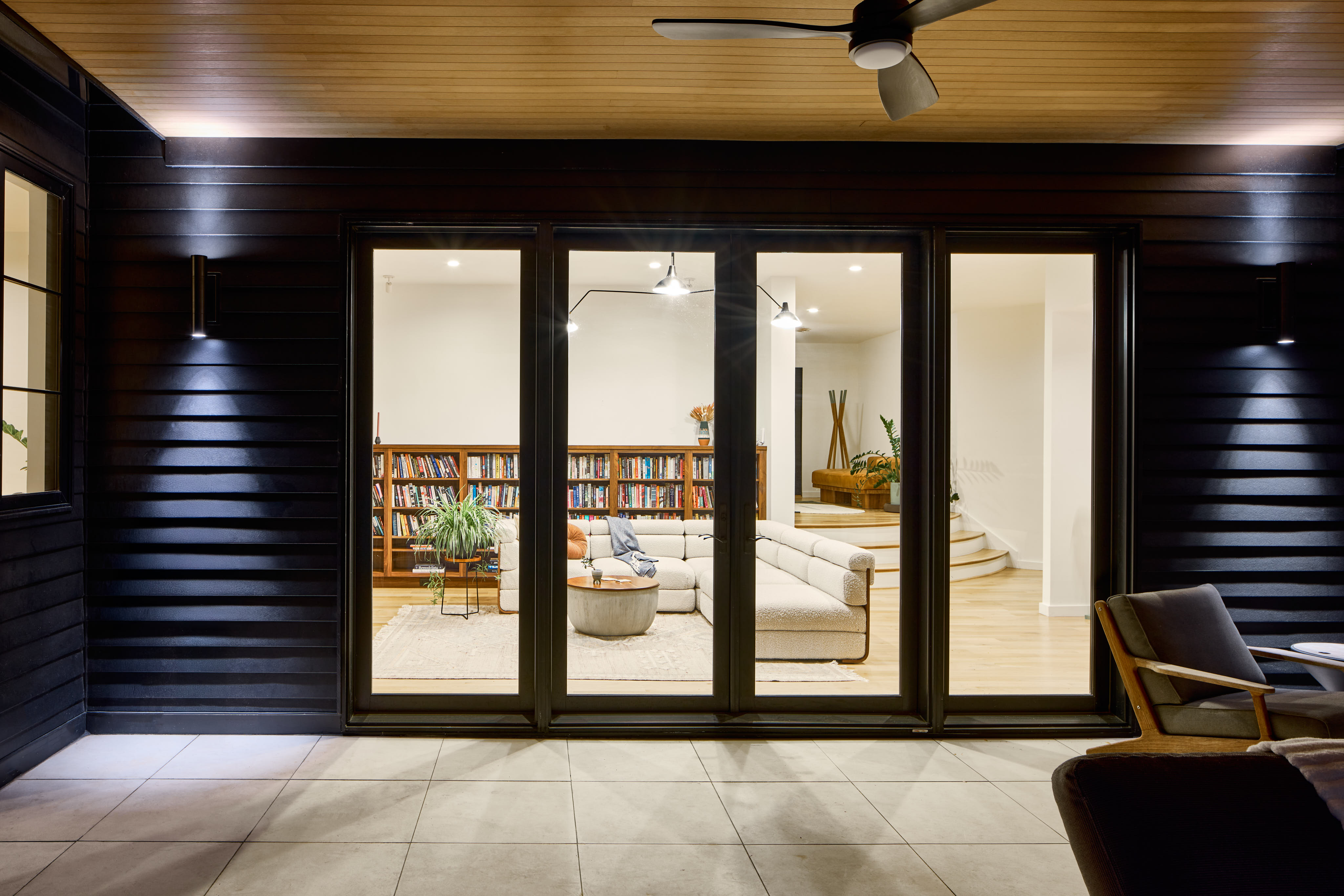
On the rest of the first floor, we shifted to a warmer color palette that aligned with the clients’ desire to incorporate walnut finishes throughout. The kitchen boasts a two-tone design, combining walnut cabinetry with a deep, rich island color. This walnut finish extends into the living room, where we added a bar featuring reeded inset cabinetry to introduce texture and interest. The family room fireplace was streamlined with a new gas insert and a full-height black plaster facade, flanked by walnut shelving on either side. To emphasize the impressive ceiling height, an oversized chandelier was installed as a striking focal point.
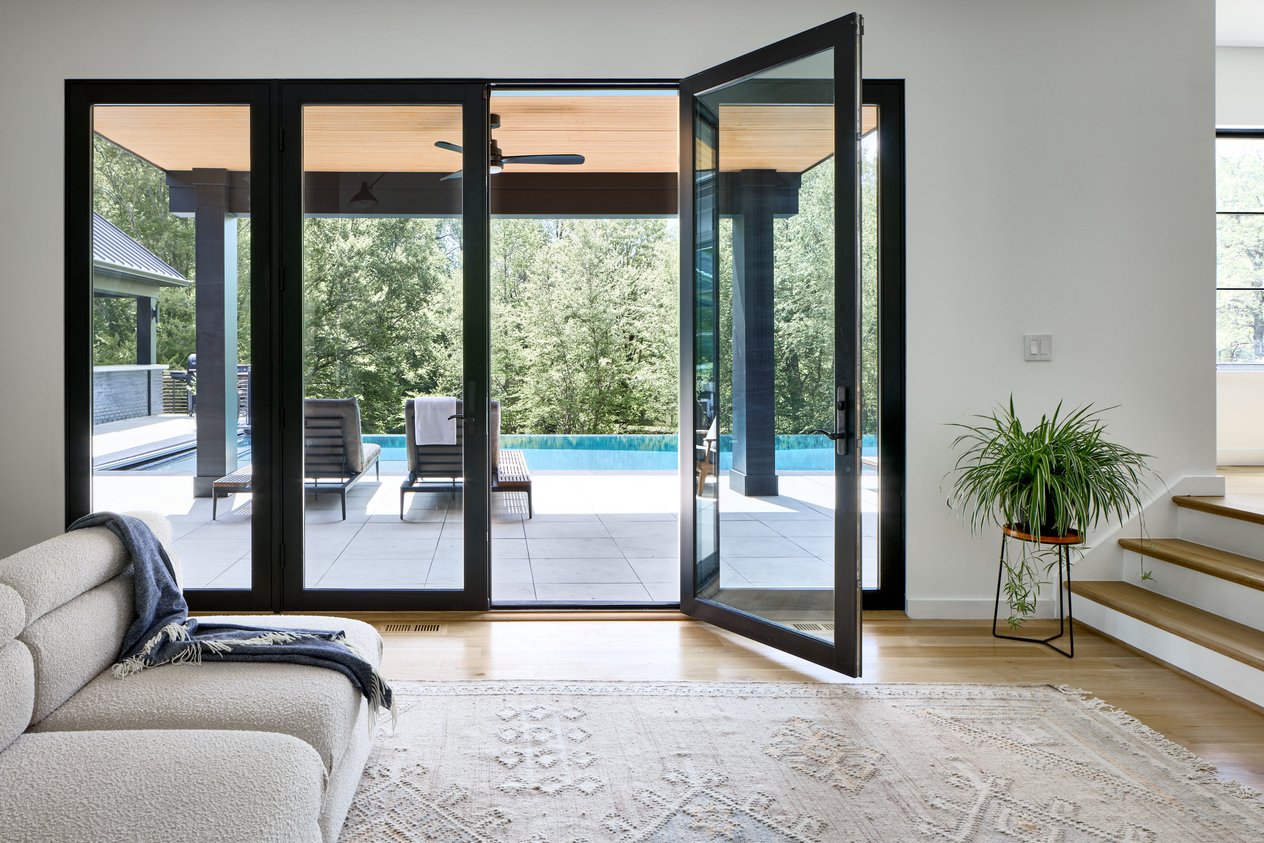
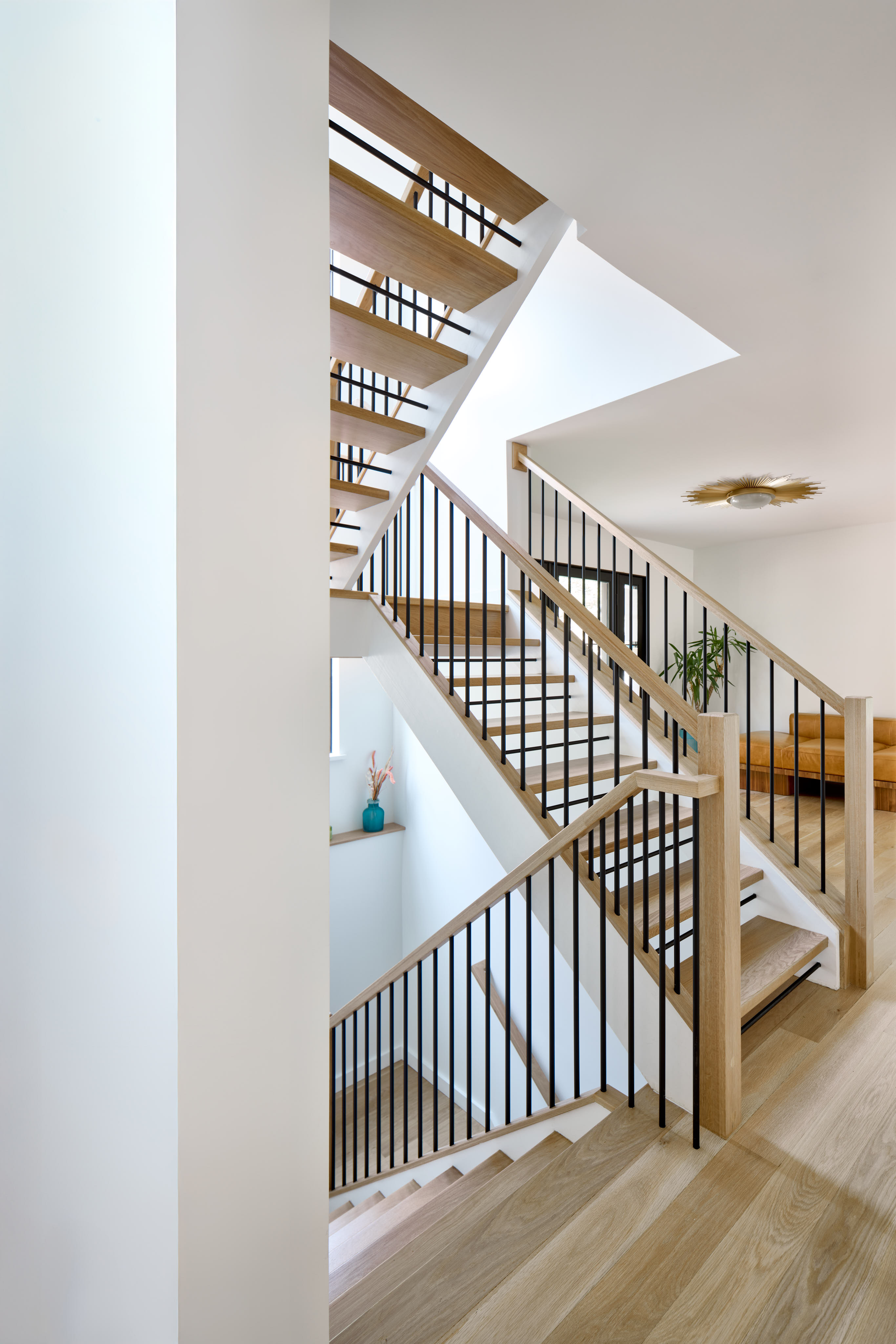
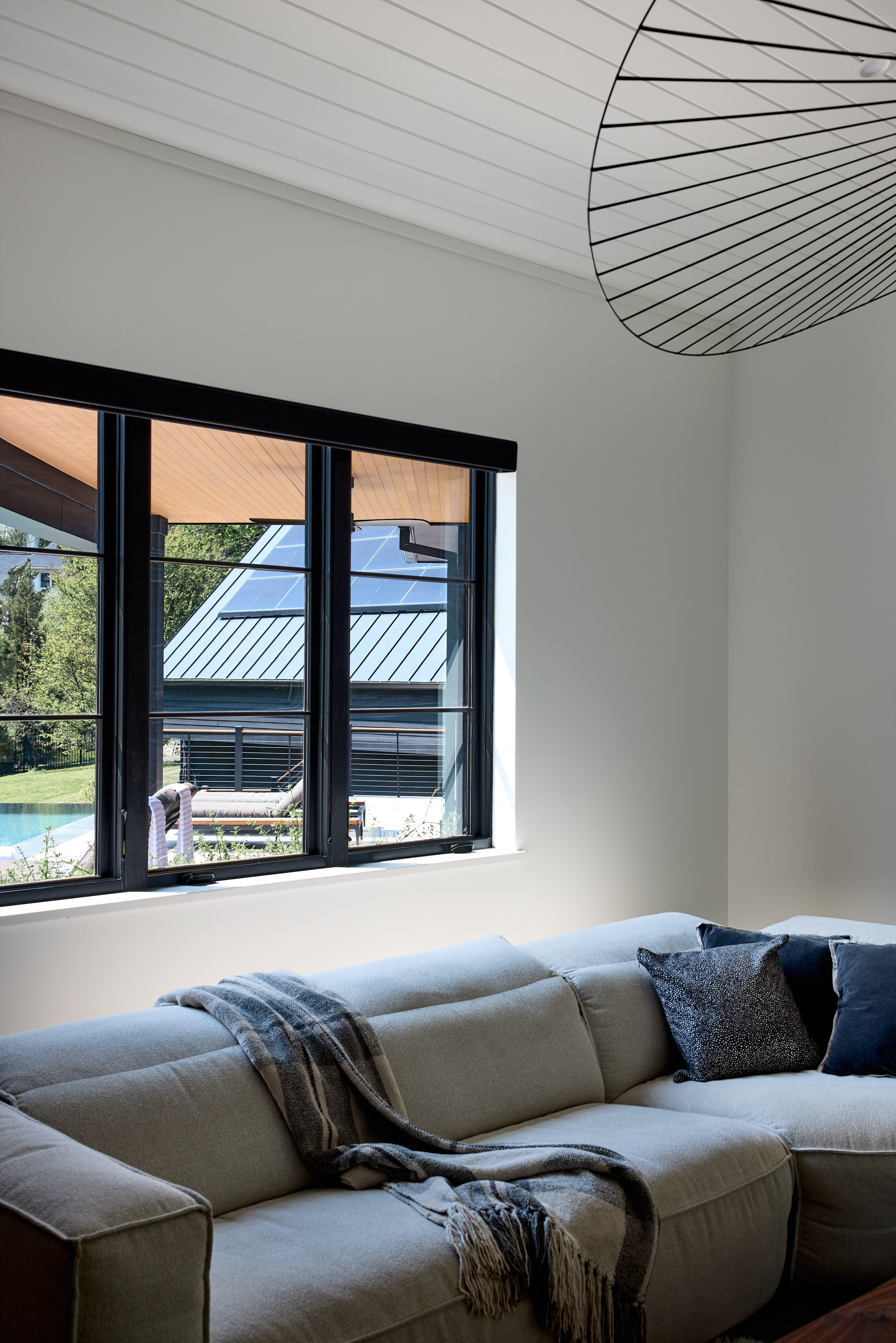
Throughout the home, black window frames were chosen both inside and out to create contrast against the crisp white walls. The home’s semicircular footprint allows views of the exterior from many interior vantage points, so matching the interior window finishes to the exterior was key to achieving a seamless and cohesive look.
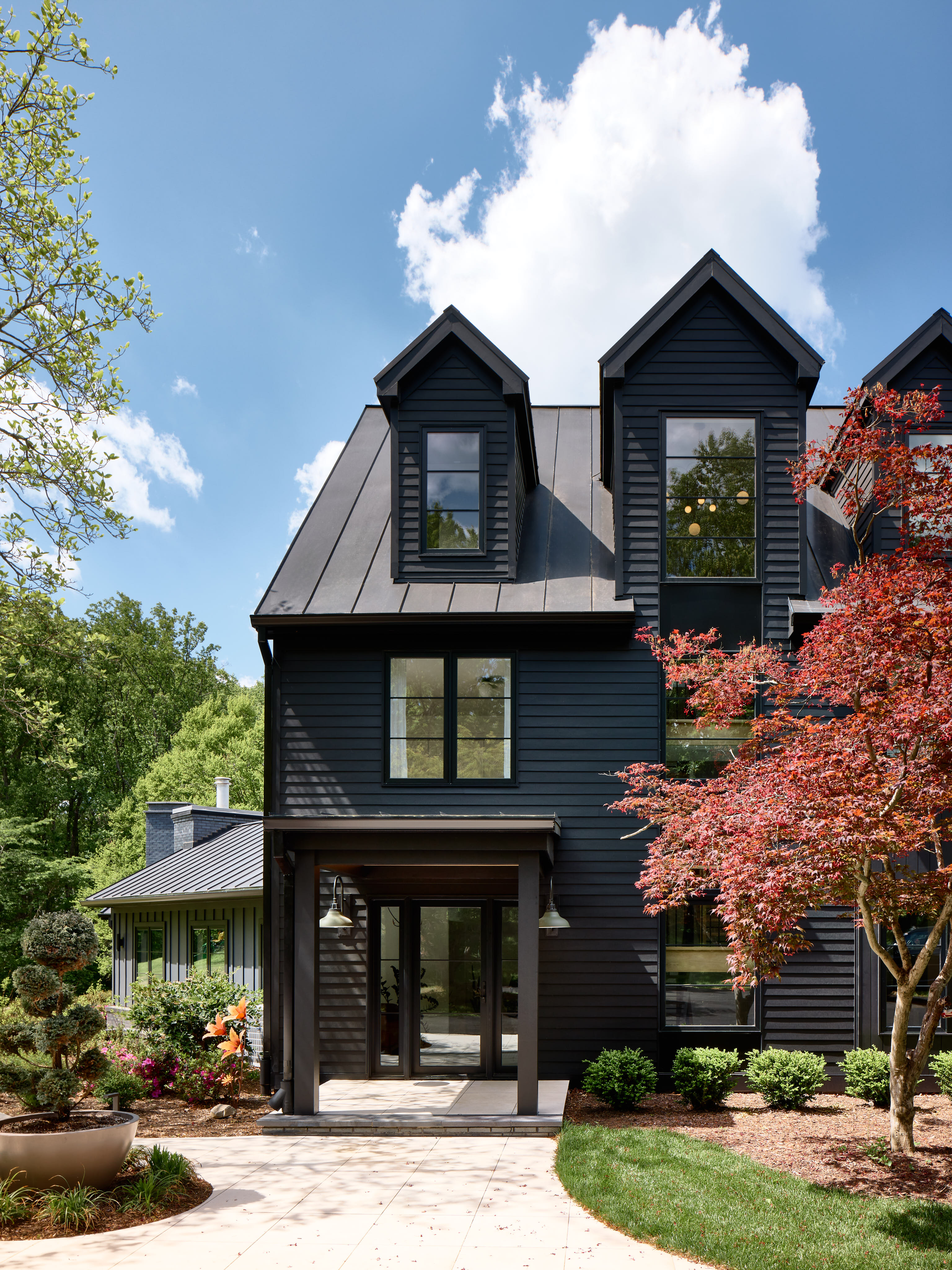
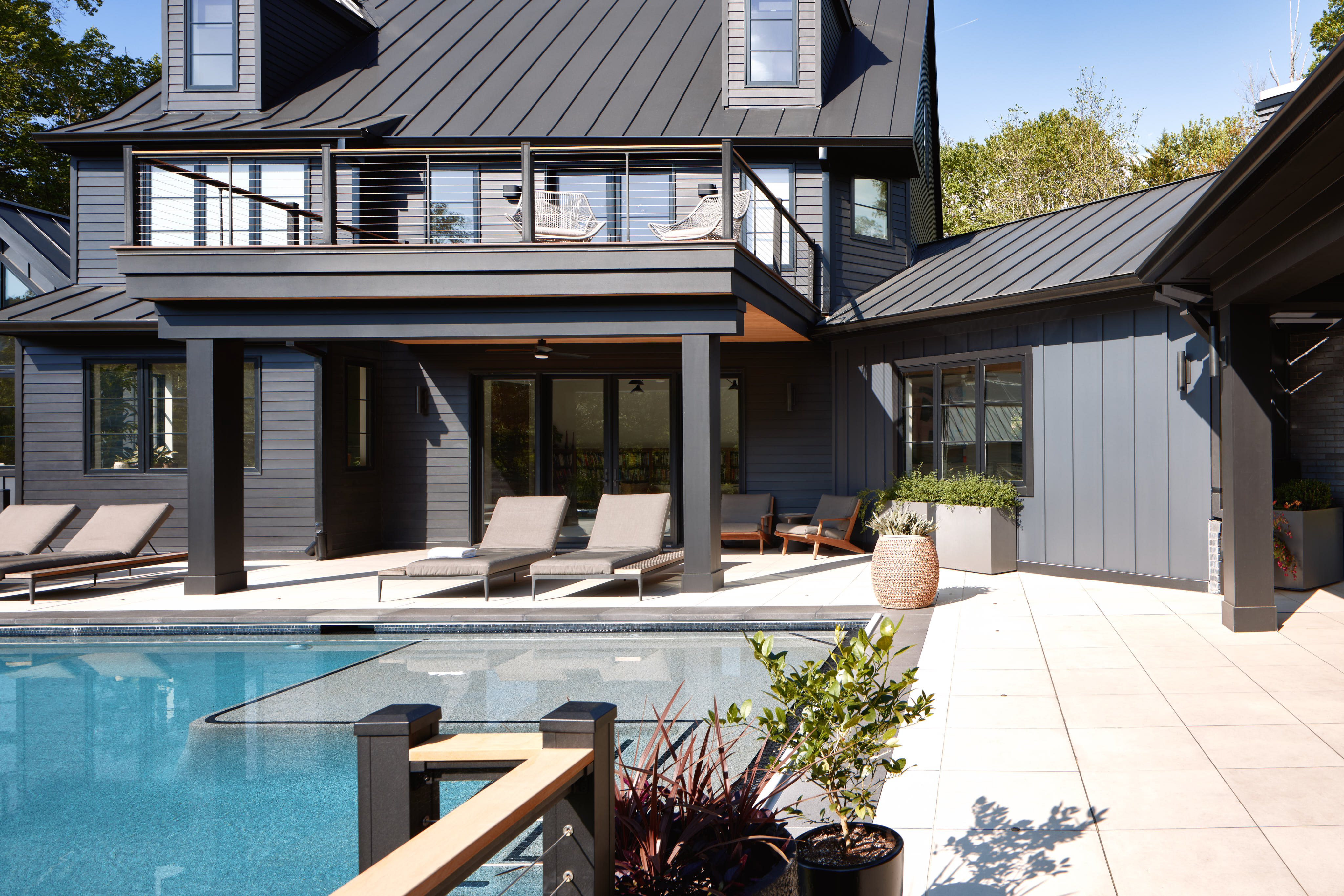
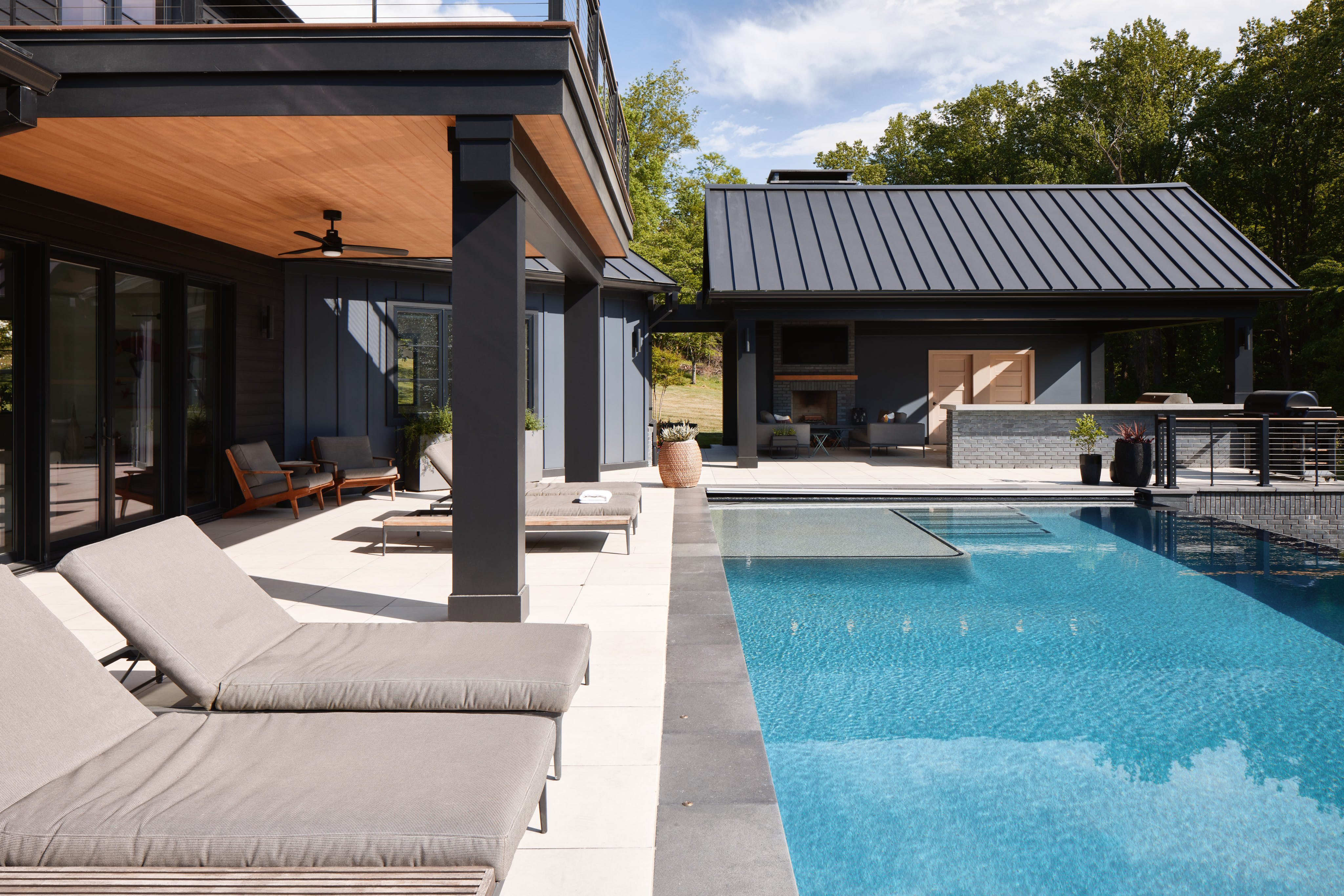
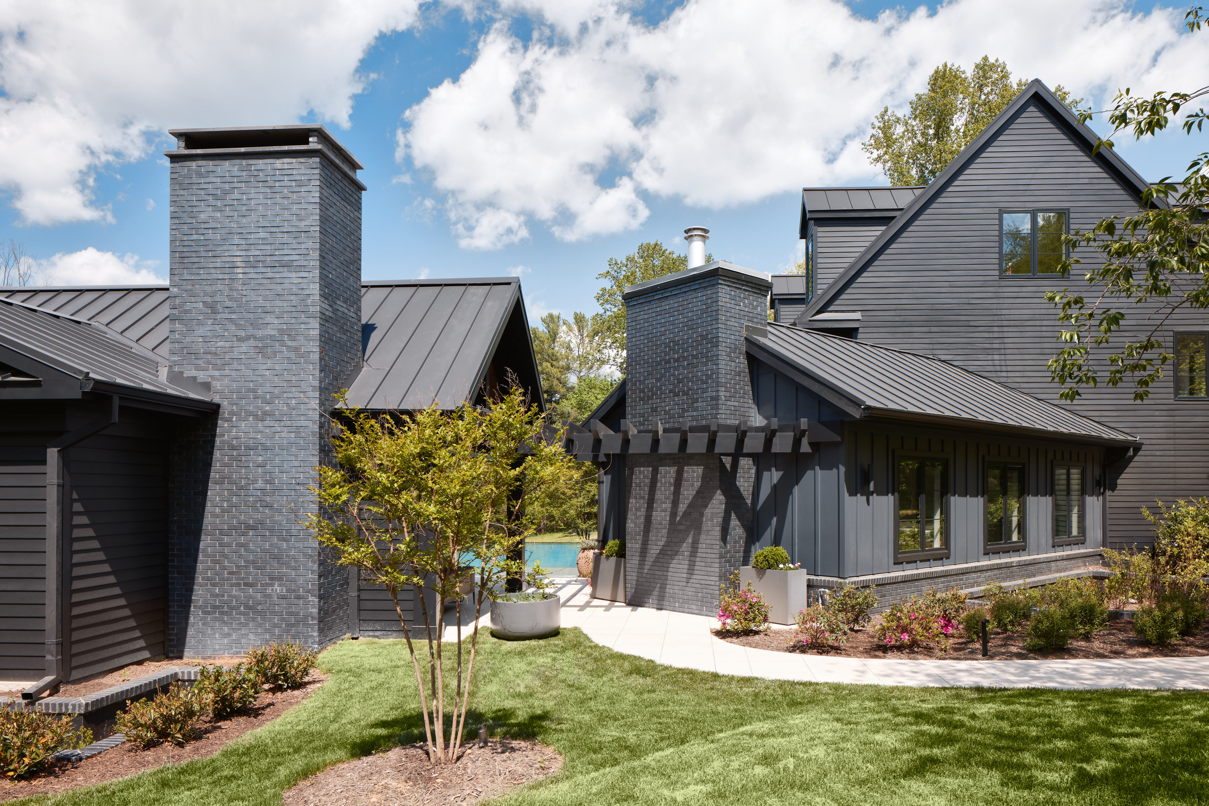
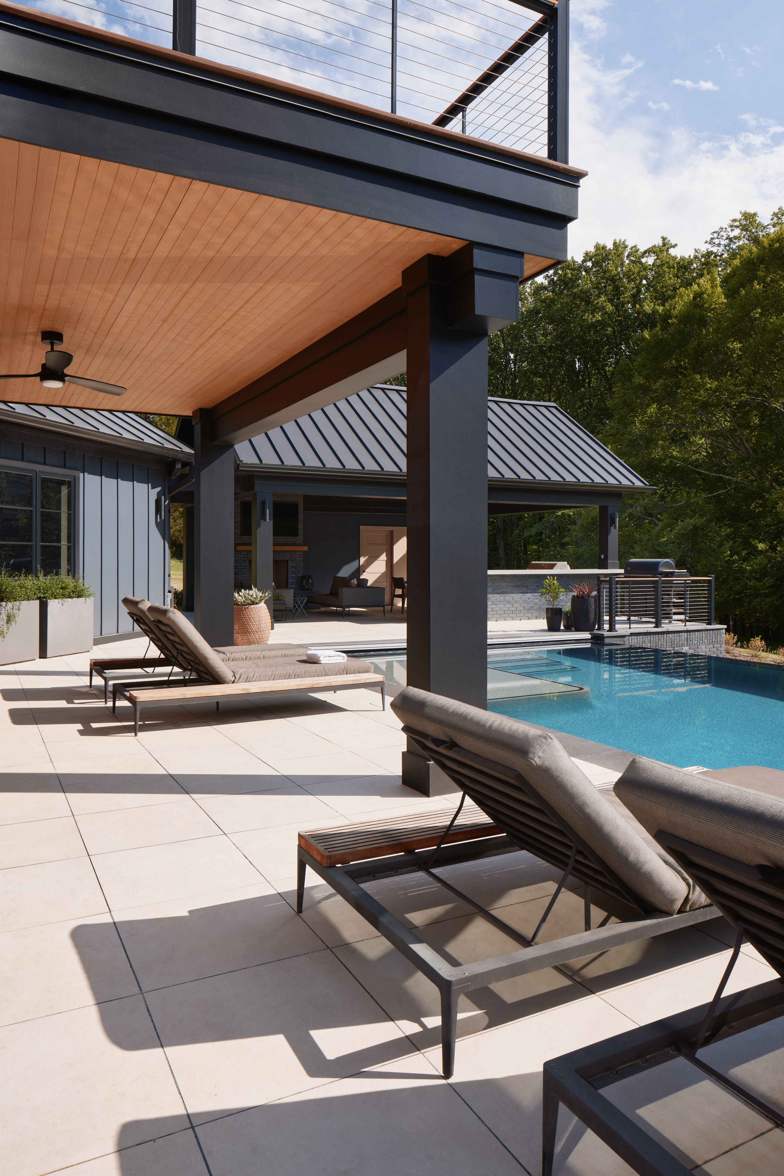
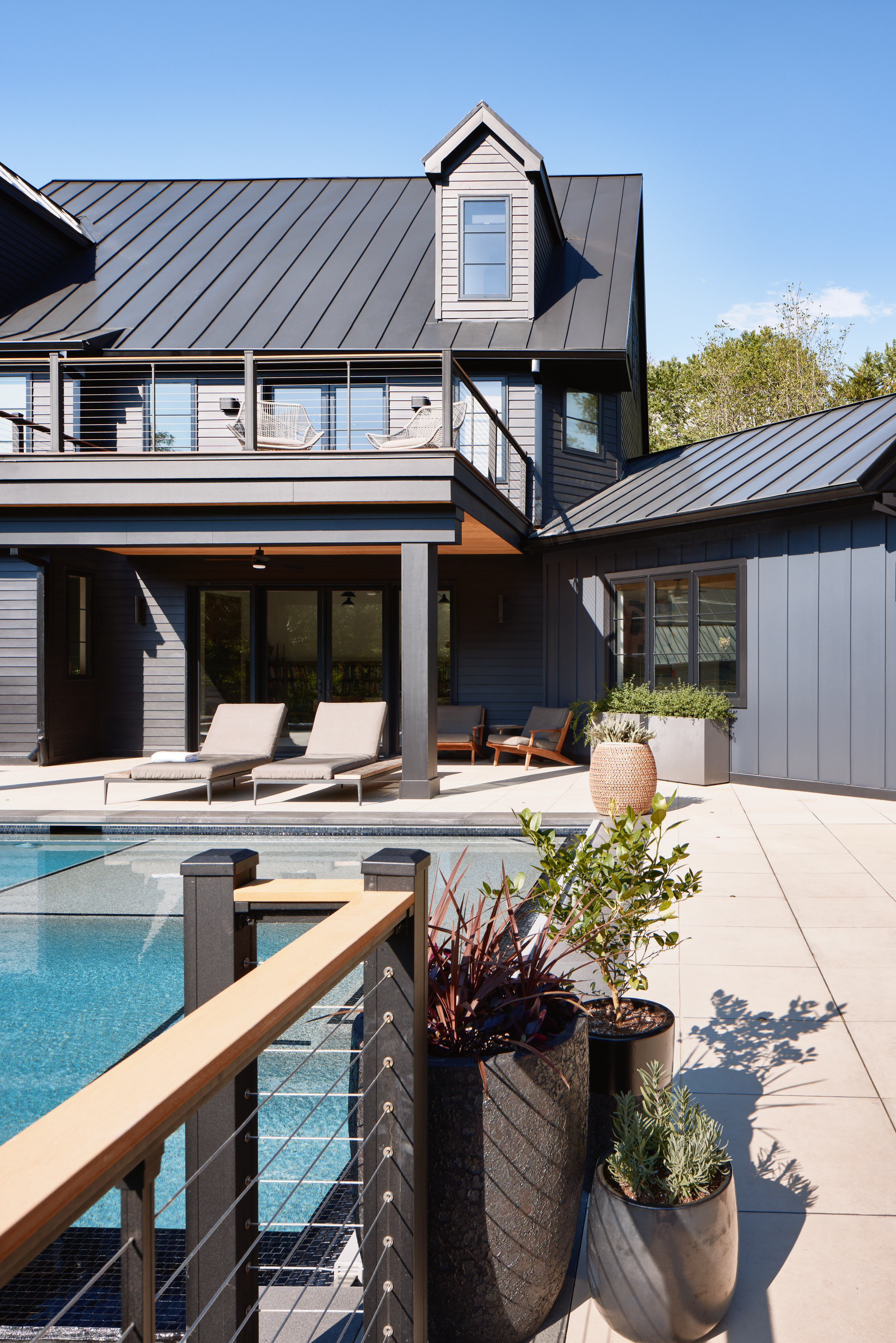
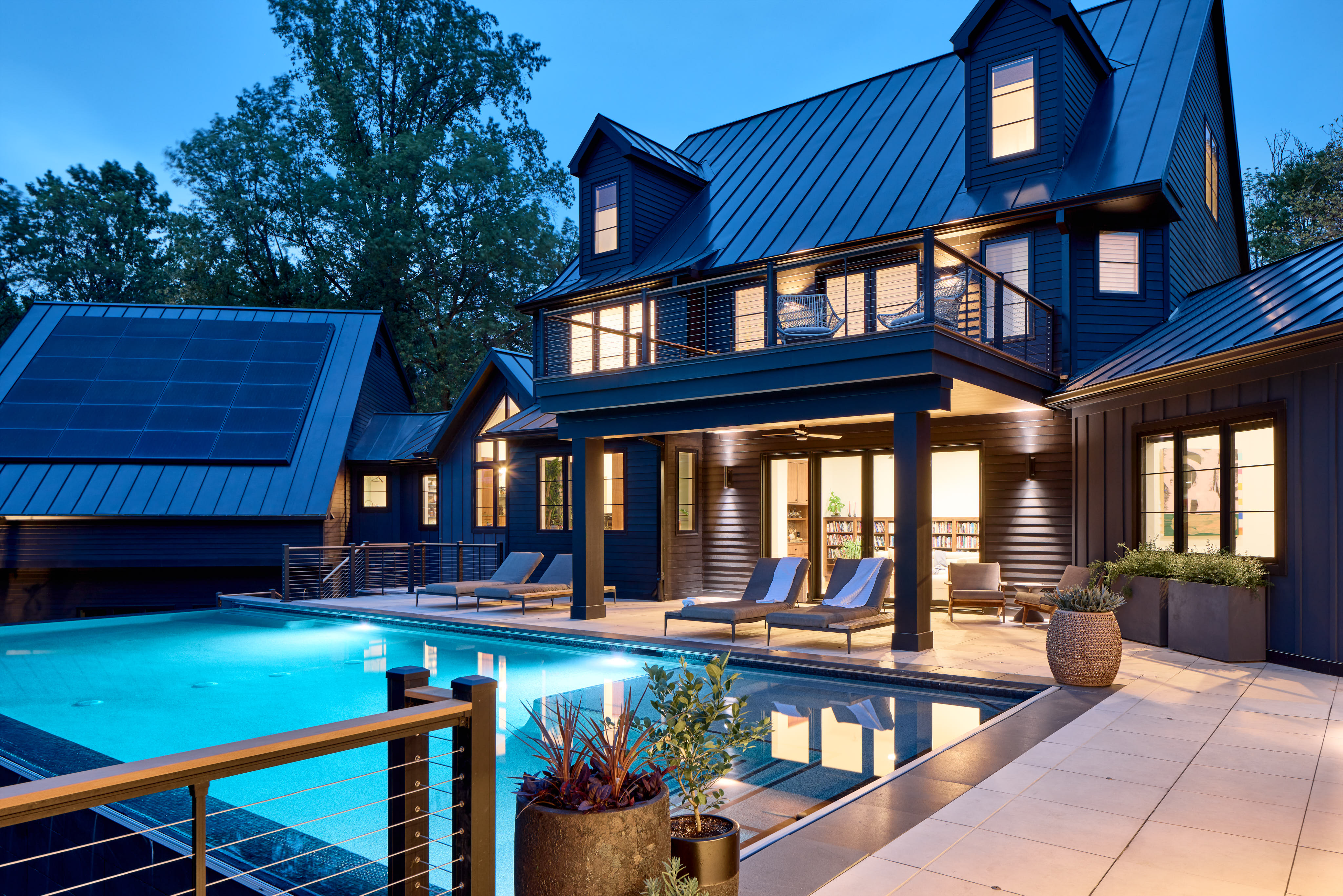
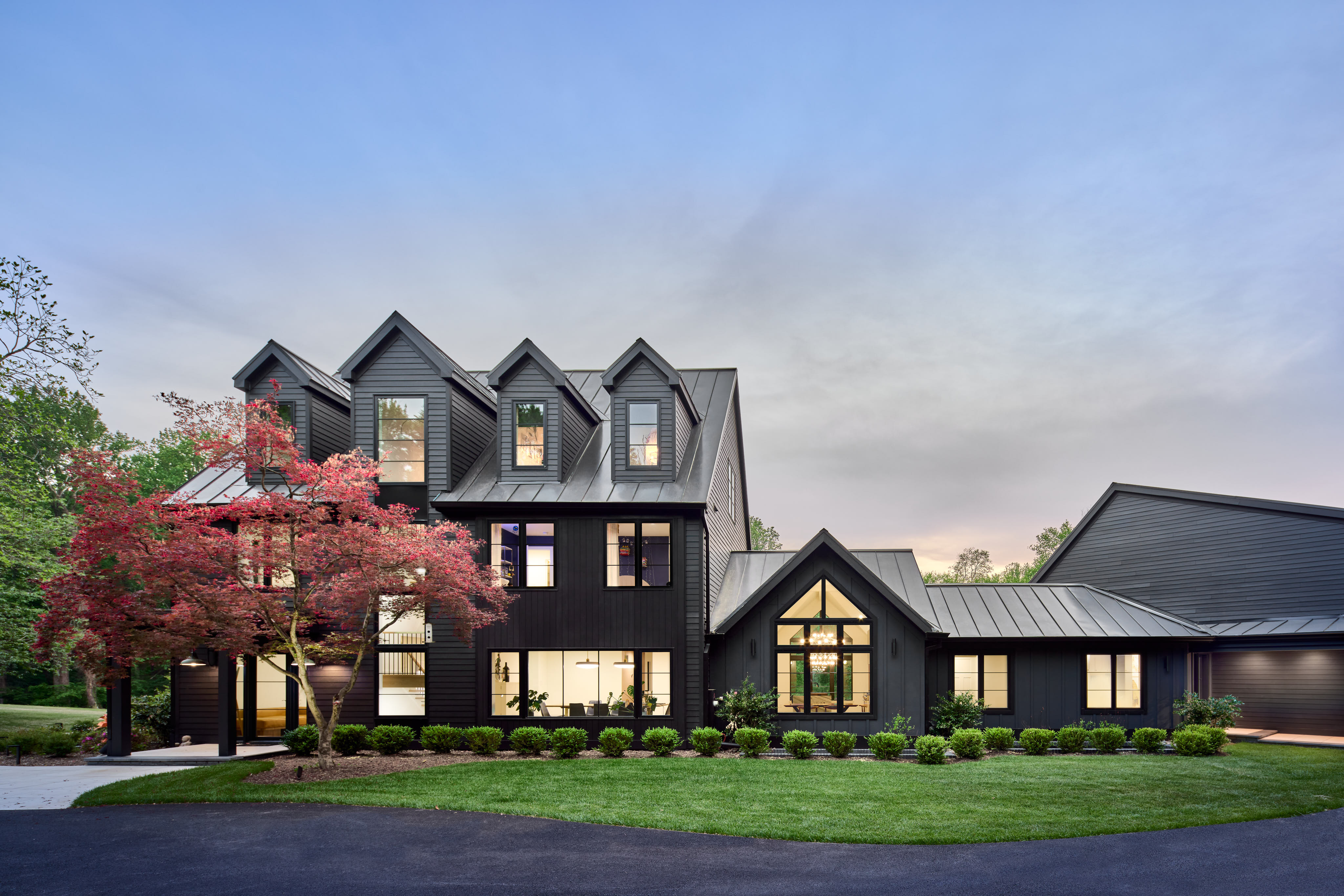
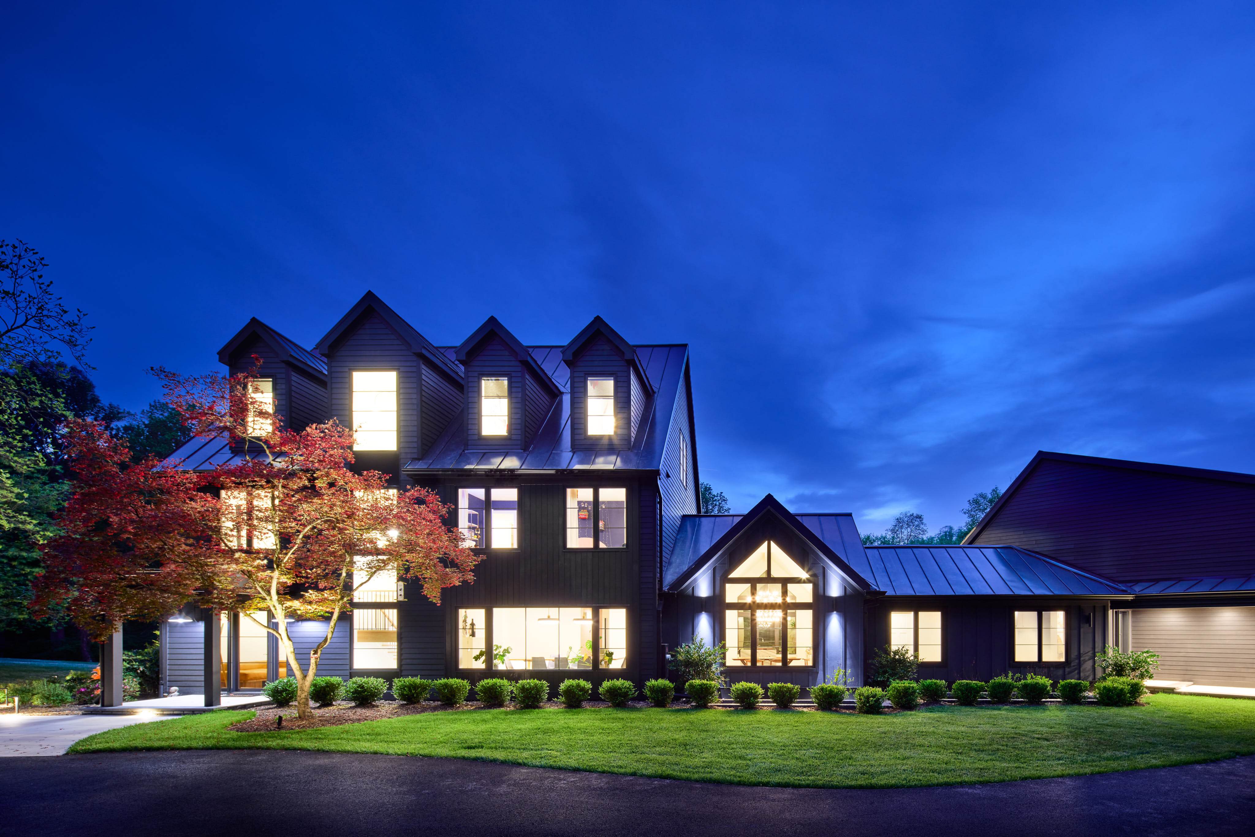
The exterior embraces a modern minimalist aesthetic with a bold, monochromatic palette that contrasts dramatically with the surrounding landscape. Obsidian-black bricks function as a water table at the base, paired with standing seam black metal roofs and graphite-colored fiber cement siding and trim. The alternating use of board-and-batten and lap siding clearly defines the four main masses of the structure, establishing rhythm and visual interest as the eye moves horizontally along the facade. The front façade was completely reworked, particularly at the staircase “tower”, where new structural systems pull the staircase away from the wall to allow a floor-to-ceiling glass wall extending from the ground to the third floor. Where lateral stability beams are necessary, recessed black sheet metal panels complement the window frames, enhancing the sleek, modern look.
Kitchen Design + Layout
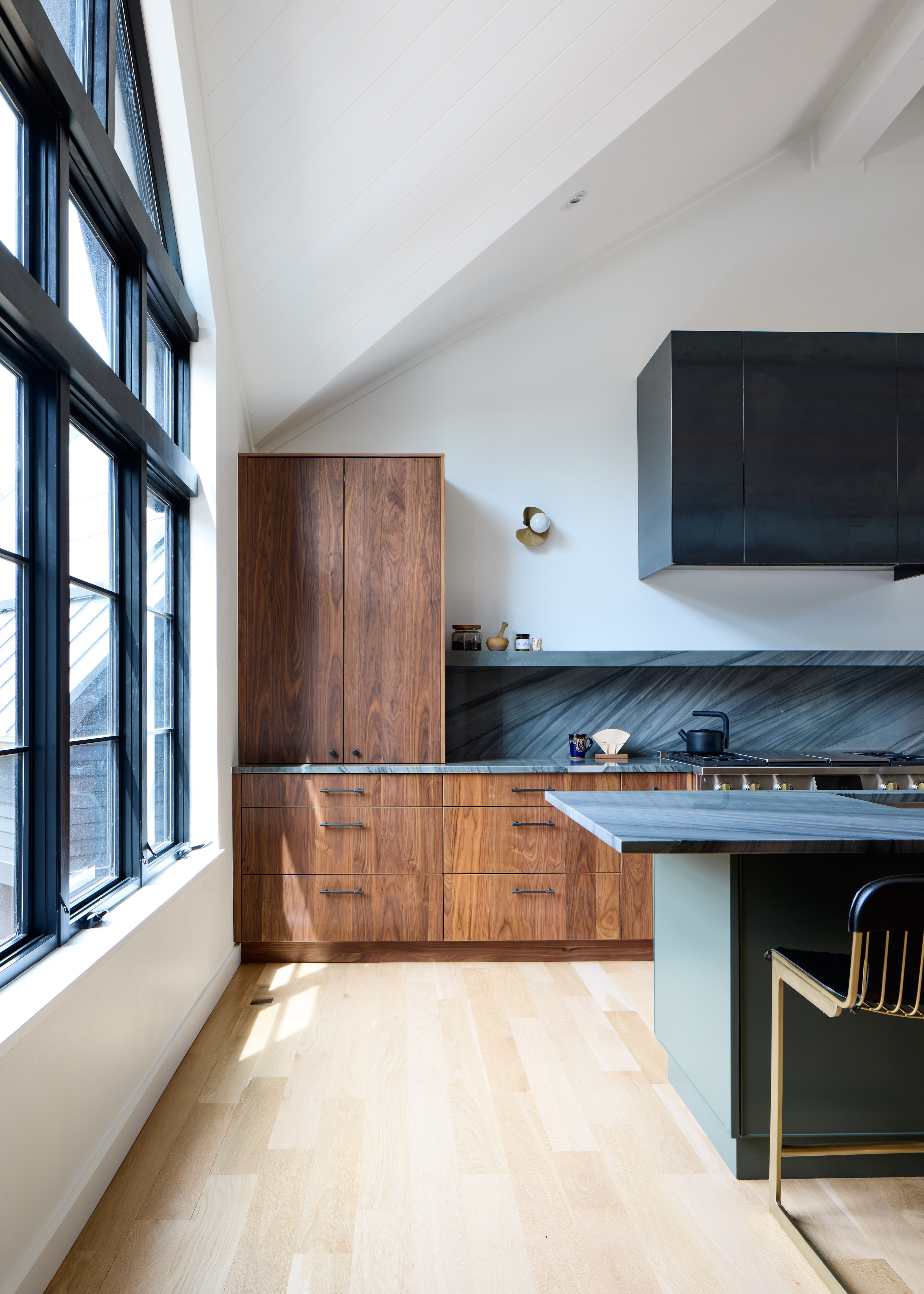
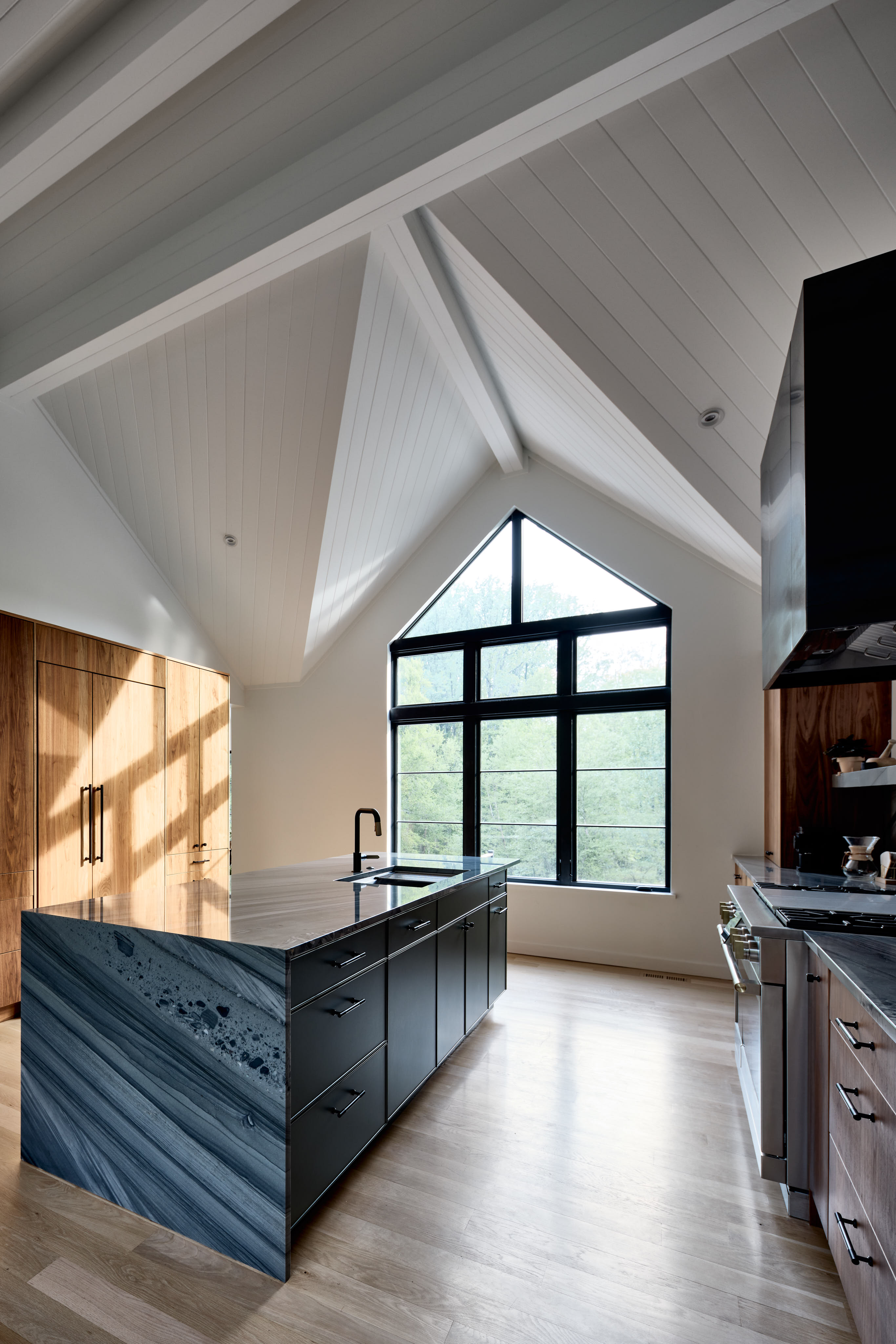
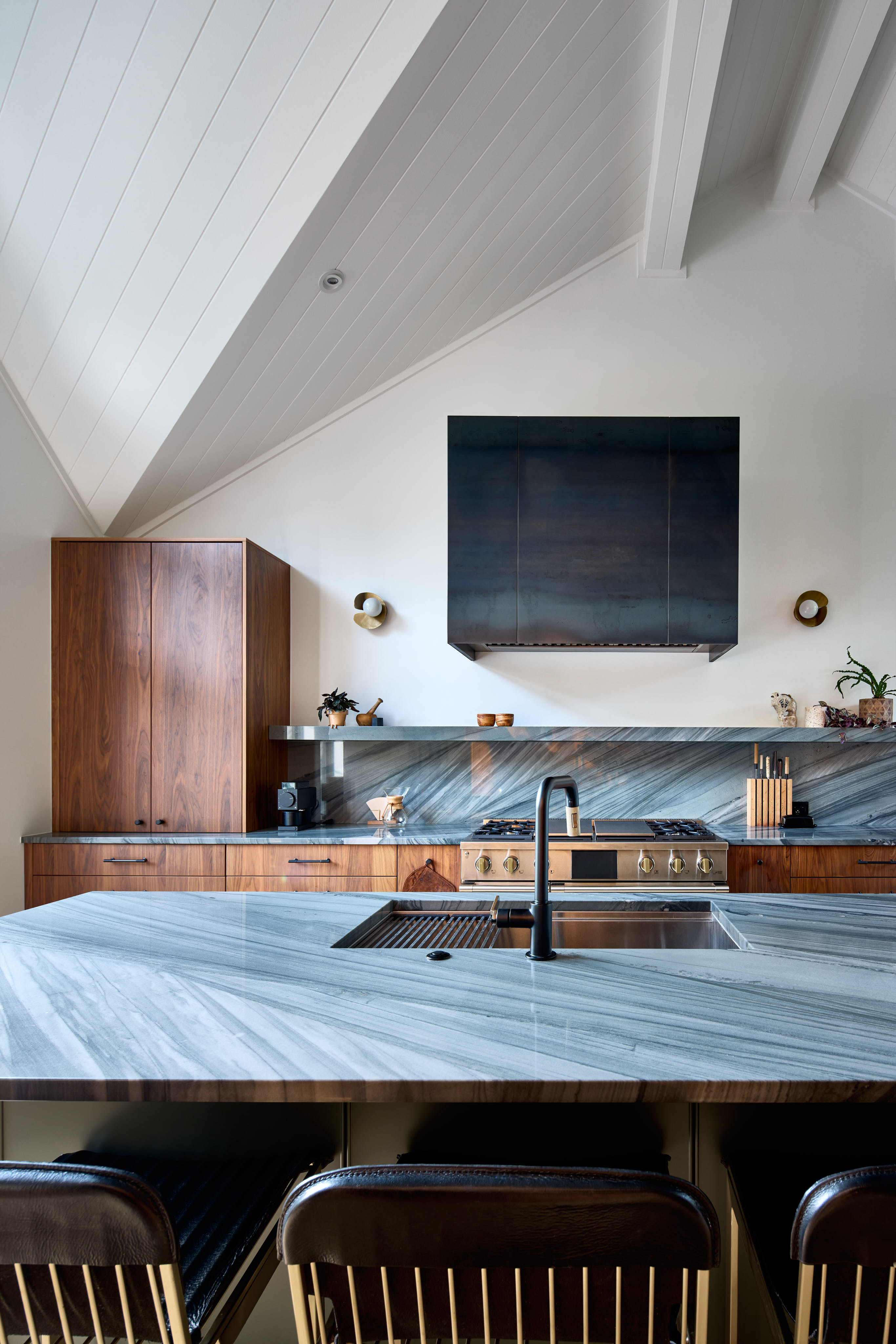
The original kitchen had great potential, with high vaulted ceilings, wood paneling, and exposed beams. It also featured large windows facing both the front and rear of the home, filling the space with natural light. As part of the renovation scope, we were tasked with enhancing these architectural elements while updating the layout to improve functionality and flow.
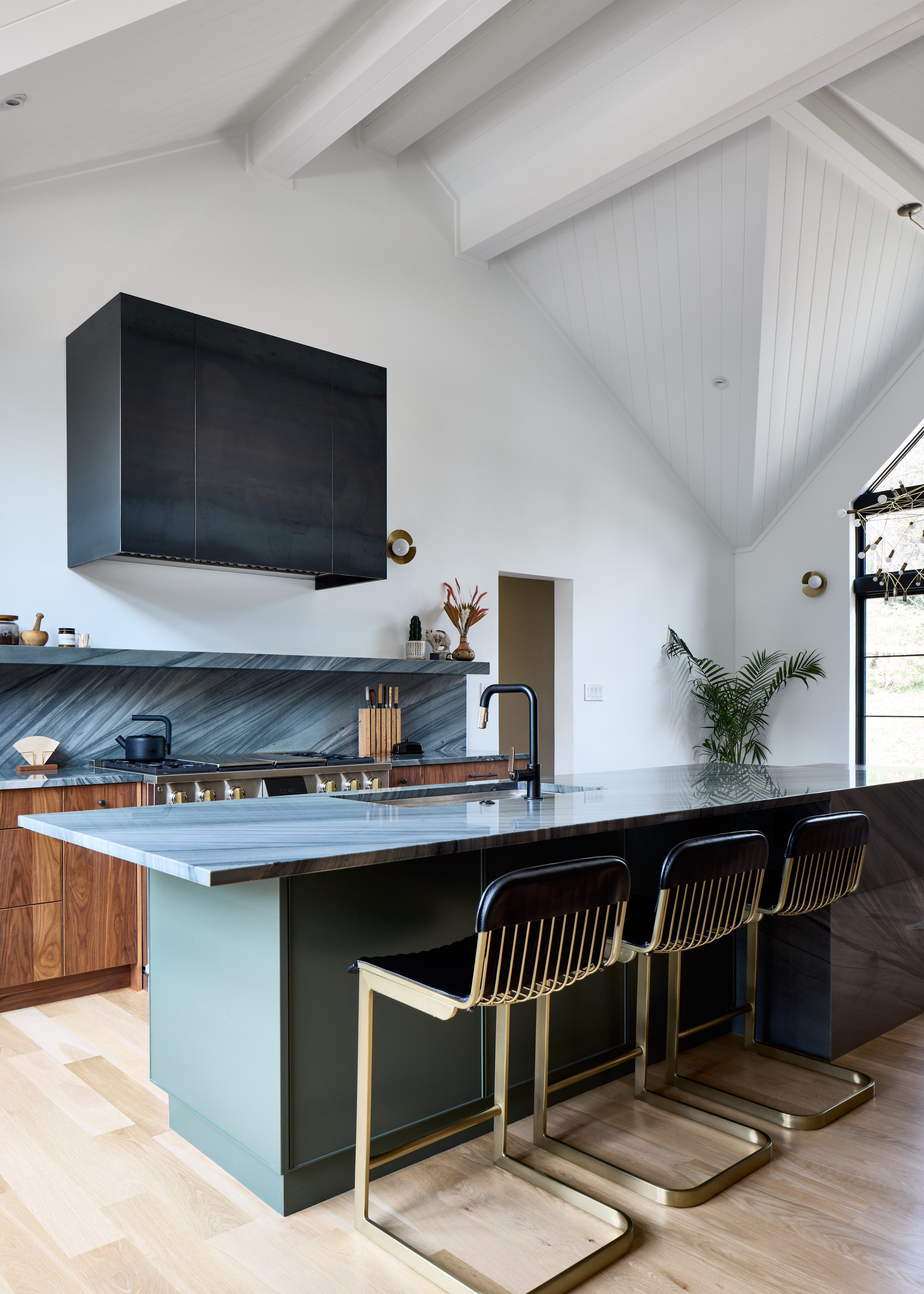
As part of the renovation, we updated the butler’s pantry adjacent to the kitchen, which allowed us to minimize the need for upper cabinetry in the main kitchen area. The design focused on centering the kitchen around newly installed oversized windows, while also creating space for a casual eat-in dining area.
We aimed for rich, dark finishes in the kitchen, incorporating natural-stained white oak flooring, flat-cut walnut cabinetry, cold-rolled steel for the custom range hood, and a deep island color—Forestwood by Sherwin-Williams. One of the kitchen’s standout features is the countertop. The clients selected Jasper quartzite for its durability and dramatic veining. To highlight this, we mitered the stone to the floor and wrapped it around the back of the island, creating a striking visual moment upon entering the space.
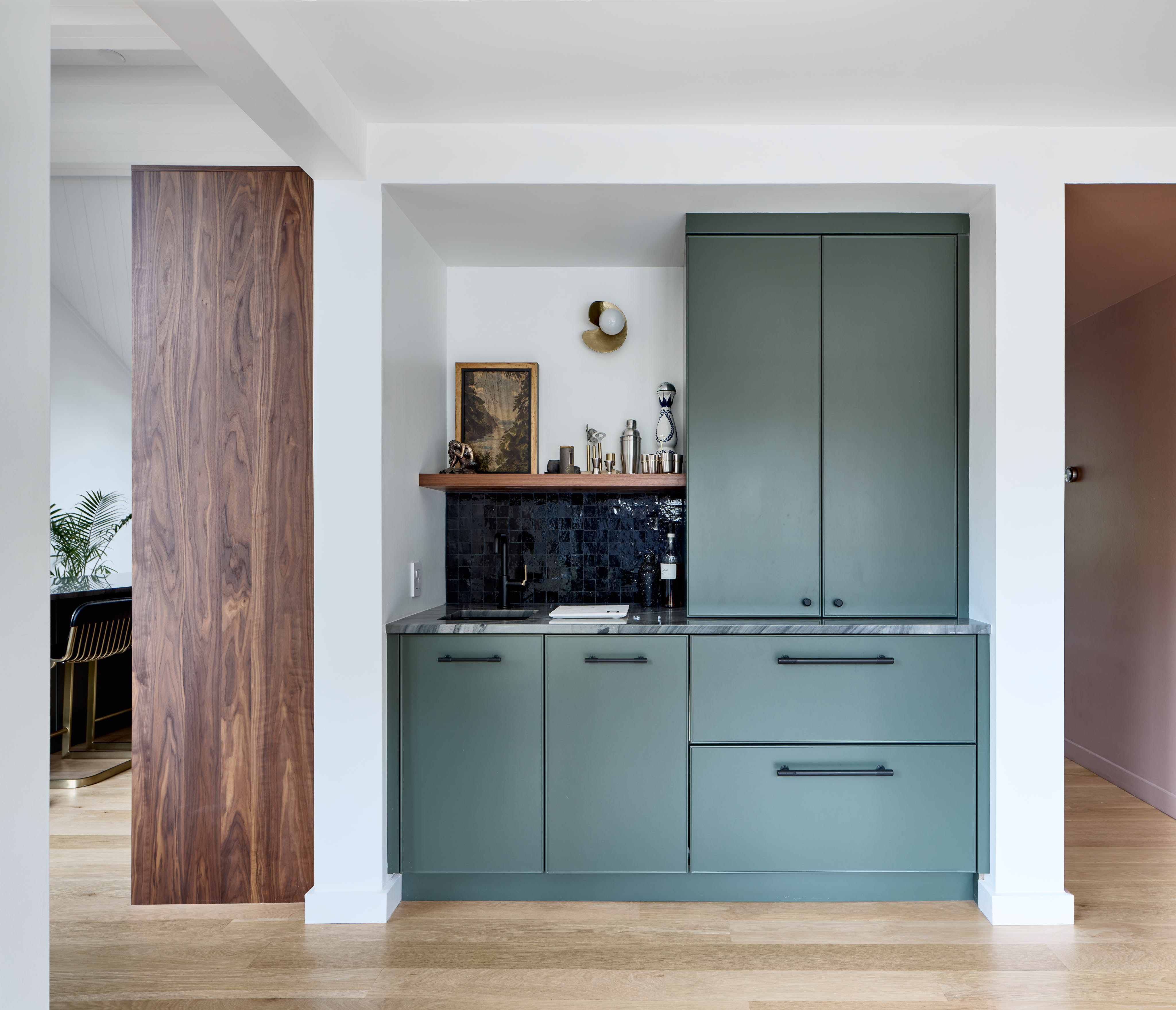
Between the kitchen and living space, we designed a small sunroom to serve as a transitional entertaining area. To make hosting easier and reduce beverage traffic in and out of the kitchen, we added a compact bar. Using the same materials as the kitchen, we incorporated a large Sub-Zero beverage refrigerator and a small bar sink to create a cohesive and functional space.
Together, these design choices elevate the kitchen and adjoining spaces, blending timeless architectural elements with modern finishes and practical functionality, ultimately creating a warm, inviting heart of the home that is perfect for family life and entertaining.
Exterior Refresh
This beautiful 8,300 SF home is located on a 3.5 acre lot just outside the reach of the city lights of Washington, DC. Prior to starting this renovation project, it was clear that the bones of this house had great potential – its secluded and quiet landscape offered a tasteful canvas – however there were many deficiencies to the existing house, in both its spatial program and its literal structure. The exterior was a dated mess consisting of clapboard siding and 1980s stone veneer, misproportioned windows and arguing roof slopes, and an overall language that just looked “confused”.
The owners wanted to bring their new home into the 21st century by initiating a contrasting renovation that would transform the exterior and give it a unique sense of cohesion, while taking a strategic approach along the way to preserve the overall massing and infrastructure of the house. The end result was a complete rework of all siding and roofing materials, new window and door proportions were introduced to give off a clear intention, and several porticos and covered structures were added on to the house.
The exterior has a modern minimalist aesthetic with its bold and monochromatic palette. Most uniquely, it gives off a dramatic contrast with the surrounding landscape. Obsidian-black bricks were added to the material palette to function as a water table, standing seam black metal roofs were introduced, and graphite-colored fiber cement siding and trim filled in the remaining areas. Deploying an alternating use of board/batten and lap siding helped define the 4 main masses of the structure by creating a sense of reference and repetition as the eye moves horizontally along the house.
Aside from the materials, one of the most dramatic changes includes the complete reworking of the front facade. At the “tower” where the main staircase is located, new structural systems were put into place to allow the staircase to be pulled away from the wall, allowing glass to go from the ground up to the 3rd floor space; where beams were needed for lateral stability, recessed black sheet metal panels were added to complement the frames of the window system. In the kitchen, direct set transom windows were installed to match the angle of the roof pitch and between them and the lower casements exists cable-tension rods to fight against kick-out forces.
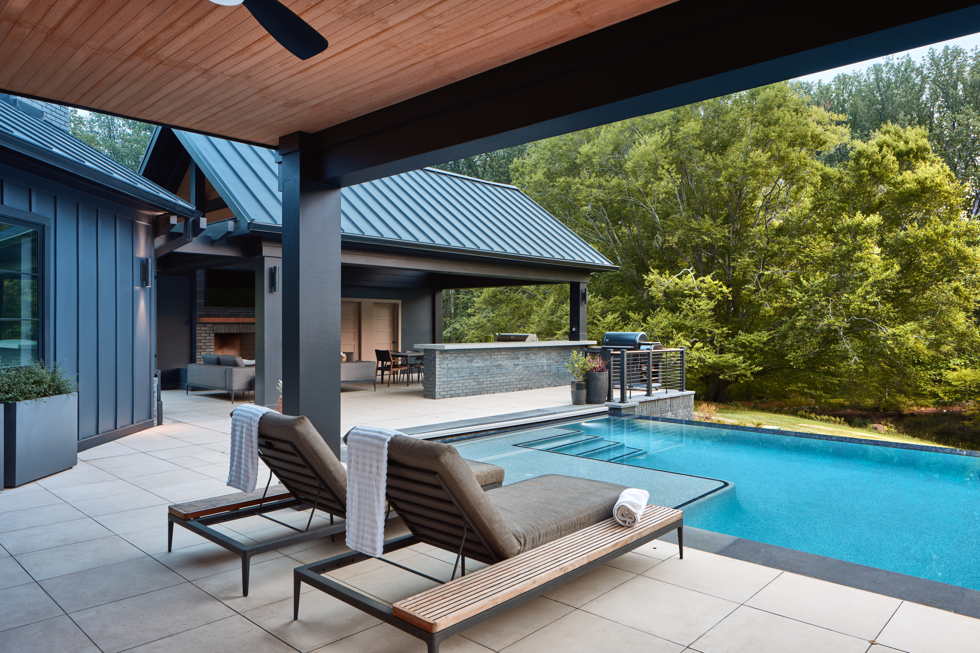
Pool + Pavilion by Pristine Acres. Photography by Steve Hershberger. Video by Townsend Visuals.